Overview
Live demo: https://webstencils.app/
Motivation
Page editors are a great way to provide an excellent user experience. However, to build one is often a pretty dreadful task.
There are existing libraries that come with a fully working page editor out of the box with a user interface and editable components. However, if you wish to make customisations such as tweaking the user interface, it will most definitely involve modifying the library itself.
WebStencils solves this problem by modularising the building blocks of a page editor. It provides a drag-n-drop system and handles the way user components should be rendered, updated and moved - among other things. With this, you'll be able to focus on building the page editor according to your own specifications and needs.
Features
It's just React
No need for complicated plugin systems. Design your editor from top to bottom the same way as you would design any other frontend application in React.
A simple user component can easily be defined as such:
import {useNode} from "@webstencils/core";

const TextComponent = ({text}) => {
  const { connectors: {drag} } = useNode();

  return (
    <div ref={drag}>
      <h2>{text}</h2>
    </div>
  )
}
Heck, the entire UI of your page editor is built using just React.
import React from "react";
import {Editor, Frame, Canvas, Selector} from "@webstencils/core";

const App = () => {
  return (
    <div>
      <header>Some fancy header or whatever</header>
      <Editor>
        {/* Editable area starts here */}
        <Frame resolver={[TextComponent, Container]}>
          <Canvas>
            <TextComponent text="I'm already rendered here" />
          </Canvas>
        </Frame>
      </Editor>
    </div>
  )
}
Control how your components are edited
An obvious requirement for page editors is that they need to allow users to edit components. With WebStencils, you control the process of which these components should be edited.
In the following example, when the user clicks on a component, we'll display a modal that requires the user to input a value for the text prop.
As the input value changes, the component will be re-rendered with updated prop.
import { useNode } from "@webstencils/core";

const TextComponent = ({text}) => {
  const { connectors: { connect, drag }, isClicked, actions: {setProp} } = useNode(
    (state) => ({
      isClicked: state.event.selected,
    })
  );

  return (
    <div ref={dom => connect(drag(dom))}>
      <h2>{text}</h2>
      {
        isClicked && (
          <Modal>
            <input
              type="text"
              value={text}
              onChange={e => setProp(e.target.value)}
            />
          </Modal>
        )
      }
    </div>
  )
}
With this, you could easily implement content editable text or drag-to-resize components, just as any modern page editor would have.
User components with droppable regions
Let's say we need a Container component which users can drop into the editor. Additionally, we would also like them to be able to drag and drop other components into the Container.
With WebStencils, it's as simple as calling the <Canvas />
import { useNode } from "@webstencils/core";

const Container = () => {
  const { connectors: { drag } } = useNode();

  return (
    <div ref={drag}>
      <Canvas id="drop_section">
        {/* Now users will be able to drag/drop components into this section */}
        <TextComponent />
      </Canvas>
    </div>
  )
}
Extensible
WebStencils provides an expressive API which allows you to easily read and manipulate the editor state. Let's say you would like to implement a copy function for a component:
import { useEditor, useNode } from "@webstencils/core";

const Container = () => {
  const { actions: {add}, query: { createNode, node } } = useEditor();
  const { id, connectors: {drag, connect} } = useNode();

  return (
    <div ref={dom => connect(drag(dom))}>
      {/*...*/}

      <a onClick={() => {
        const { data: {type, props}} = node(id).get();
        add(
          createNode(React.createElement(type, props))
        );
      }}>
        Make a copy of me
      </a>
    </div>
  )
}
Serializable state
The editor's state can be serialized into JSON which you can then apply a compression technique of your choice for storage.
const SaveButton = () => {
  const { query } = useEditor();

  return <a onClick={() => console.log(query.serialize()) }>Get JSON</a>
}
Also, you can recreate the entire state from the JSON string:
const App = () => {
  const jsonString = "/* retrieve JSON from server */";

  return (
    <Editor>
      <Frame data={jsonString}>
        {/*...*/}
      </Frame>
    </Editor>
  )
}
Acknowledgements
- craft.js: the original project by Previnash Wong Sze Chuan that inspired this library, MIT license
Sponsor
Coming soon
Nodes
User Elements
User Elements are React Elements which the end user will have the ability to manipulate. In other words, these are the elements which you will want your users to edit, drag and/or drop in your editor.
Just like React Elements, these can be either simple HTML tags or React Components. We'll refer to User Elements which are React Components simply as User Components.
Node
WebStencils maintains an internal state comprised of objects called Nodes which represent and manage User Elements that are rendered in the editor. These Nodes contain information such as the element type, current props, DOM element, parent Node and so on. Hence, every User Element is rendered and managed by their corresponding Node.
Canvas Node
A Canvas is a special type of Node which enables its corresponding user element to be a droppable region, where its child Node's user element will be made draggable.
In a nutshell:
- A Canvas node defines a droppable region
- A Node that is a child of a Canvas is draggable
- A Canvas node itself is not draggable unless it is a child Node of another Canvas.
Representing User Elements as Nodes
Let's take a look at how User Elements are actually represented as Nodes:
<div style={{ background: "#333" }}> // A Node with the type div;
  <h1>Hi</h1> // Node of the type h1; not draggable
  <MyComp>Hey</MyComp> //  Node of the type MyComp; not draggable
  <MyContainerComponent> // A Node with the type MyContainerComponent; not draggable
    <h2>Second level</h2> // A Node with the type h2; not draggable!
  </MyContainerComponent>
</div>
In the above example, a Node is created for each React element.
The top-level div has 3 child nodes and the MyContainerComponent Node has a h2 child Node.
By default, a non-Canvas Node is created.
So, how do we actually create a Canvas node? For example, how do we make the top-level div into a Canvas Node, so we could drag/drop its children around?
This is where the <Element /> component becomes handy in manually defining Nodes.
<Element is="div" style={{ background: "#333" }} canvas> // A Canvas Node with the type div;
  <h1>Hi</h1> // Node of the type h1; draggable
  <MyComp>Hey</MyComp> //  Node of the type MyComp; draggable
  <MyContainerComponent> // A Node with the type MyContainerComponent; draggable
    <h2>Second level</h2> // A Node with the type h2; not draggable!
  </MyContainerComponent>
</Element>
The
isprop specifies the type of User Element to create; it can be either an HTML tag or a User Component
In the above example, using the <Element /> component with the canvas prop, we've created a Canvas node of the type div.
Since our div element is now handled by a Canvas node, therefore it is now a droppable region.
On the other hand, since h1, MyComp and MyContainerComp are child Nodes of a Canvas, they are now draggable.
The <Element /> component can also be used to configure other values of a Node, which is further detailed here
User Components
User Components are intended to be written just like any other React Component.
Let's start with a simple Text component:
const Text = ({text, fontSize}) => {
  return (
    <span contenteditable="true" style={{fontSize}}>{text}</span>
  )
}
Now, let's actually get the component to work with the editor.
The useNode hook provides us with some information and methods related to the corresponding Node that manages the component.
const {
  connectors: { connect, drag },
  actions: { setProp },
  ...collected
} = useNode((node) => {});
Additionally, we can pass configuration values via the static craft property:
const Text = () => {/*...*/}
Text.craft = {
  props: {},
  rules: {
    canDrop: () => true,
    canDrag: () => true,
    canMoveIn: () => true,
    canMoveOut: () => true
  },
  related: {}
}
We are going to explore each of these values in the following sections.
Connectors
The first thing we would want to do is to actually let WebStencils to manage the DOM for our component.
connect: specifies the DOM that represents the User Component. If the component's corresponding Node is a Canvas, then this also defines the area that is droppable.drag: specifies the DOM element that should be made draggable. When the user drags this element, it'll be considered as dragging the entire component, therefore moving the entire component to the drop location. This connector only takes effect if the component's corresponding node is a Canvas Node.
const Container = ({children}) => {
  const { connectors: {connect, drag} } = useNode();
  return (
    <div ref={dom => connect(drag(dom))}>
      {children}
    </div>
  )
}

const App = () => {
  return (
    <Editor resolvers={{Container}}>
      <Frame>
        <Element is={Container} canvas> // (i)
          <Container> // (ii)
            <h2>Hi</h2>
          </Container>
          <Element is={Container} canvas> // (iii)
            <h2>Hi</h2>
          </Element>
        </Element>
      </Frame>
    </Editor>
  )
}
- i.
Elementis being rendered with a Canvas Node, thus it defines a droppable region. However, since it is not a child of a Canvas Node, it is not draggable (thedraghandler will not do anything). - ii.
Containeris an immediate child of a Canvas Node; it is draggable. - iii.
Elementis an immediate child of a Canvas Node and is rendered with a Canvas Node - it is both draggable and droppable.
Props Manipulation
You've probably seen page editors where you could directly interact with the components and manipulate them. For instance, drag to resize an image or visually edit a text. This is easily achievable with WebStencils as well.
Since components are managed by their corresponding Node which contains information including the component's props, thus we can call the setProp method to update the prop values stored in the Node. In turn, this will re-render the component with its updated values.
const Text = ({text, fontSize}) => {
  const { connectors: {connect, drag}, actions: {setProp} } = useNode();

  return (
    <span ref={dom => connect(drag(dom))} style={{fontSize}} onKeyUp={(e) => {
        setProp(props => {
          props.text = e.target.innerText;
        })
      }}>{text}
    </span>
  )
}
In the above example, we have updated our span element to be content editable and added an event handler to update the text prop as the user visually enters in a new value.
Collecting Node State
The information stored in a corresponding Node could be useful in helping you build more usable components. We can retrieve information from a Node by passing a collector function to the useNode hook. Every time the values we retrieved via the collector function changes, our component will re-render. This is very much similar to Redux's connect pattern.
For instance, let's say we would like to enable the content editable text from the previous section only when the user has actually clicked on our component:
const Text = ({text, fontSize}) => {
  const {
    connectors: { connect, drag },
    actions: { setProp },
    isClicked
  } = useNode((node) => ({
    isClicked: node.events.selected
  }));

  return (
    <span ref={dom => connect(drag(dom))} style={{fontSize}} contentEditable={isClicked} onKeyUp={(e) => {
        setProp(props => {
          props.text = e.target.innerText;
        })
      }}>{text}
    </span>
  )
}
Default Props
While it's not necessary as we could simply define default parameters (e.g.: ES6 defaults) directly within our components, these default values will not actually be recorded into the component's corresponding Node, which could leave us with a lot of empty prop values when we wish to retrieve the Node for a component when building other parts of our editor (eg: a Toolbar for editing a component's values).
To prevent that, we can explicitly specify default prop values via the craft.props like the following:
const Text = ({text, fontSize}) => { /** same as previous example **/ }
Text.craft = {
  props: {
    text: "Hi there!",
    fontSize: 12
  }
}
Specify drag/drop rules
You may want to restrict how your components are dragged or what goes in and out of your component.
These rules can be specified in the static craft.rules.
Let us write a (pretty strange) rule for our Text component which users can only drag if they change the text prop to "Drag":
const Text = ({text, fontSize}) => { /** same as the previous example **/ }
Text.craft = {
  props: { /** same as the previous example **/ },
  rules: {
    canDrag: (node) => !!node.data.props.text == "Drag"
  }
}
Related Components
What happens if you need to design some component to complement our user component? For instance, if we were planning on building a Toolbar somewhere in our page editor, we would like the Toolbar to display a bunch of text inputs to allow the user the edit the currently selected component. It would be great if we could retrieve a specific component that has all the relevant inputs for the user to edit the currently selected component.
This is where related components become useful. These components share the same corresponding Node as the actual user component, hence the useNode hook that we have been using all this while will be made available to these components as well.
const Text = ({text, fontSize}) => { /** same as the previous example **/ }
Text.craft = {
  related: {
    toolbar: TextToolbarSettings
  }
}

const TextToolbarSettings = () => {
  const { actions: { setProp }, fontSize } = useNode((node) => ({
    fontSize: node.data.props.fontSize
  }));

  return (
    <div>
      <h2>Text settings</h2>
      <input
        type = "number"
        value={fontSize}
        placeholder="Font size"
        onChange={e =>
          setProp(prop => prop.fontSize = e.target.value)
        }
       />
    </div>
  )
}
Now, let's say we have a Toolbar component somewhere in our editor. We can easily retrieve the related component as such:
const Toolbar = () => {
  const { selectedNodeId, toolbarSettings } = useEditor((state) => ({
    selectedNodeId : state.event.selected,
    toolbarSettings:  state.nodes[state.events.selected].related.toolbar
  }));

  return (
    <div>
      <h2>My Awesome Toolbar</h2>
      {
        selectedNodeId && toolbarSettings ?
          React.createElement(toolbarSettings)
        : null
      }
    </div>
  )
}
Defining editable elements
Now, let's say we are creating a new User Component like so:
const Hero = ({background}) => {
  return (
    <div style={{ background }}>
      <span>Hero Title</span>
    </div>
  )
}
Then, we decide that we want to have the span element to be editable independent of the Text user component we made earlier.
Your first instinct might be to just use the Text component directly:
const Hero = ({background}) => {
  return (
    <div style={{ background }}>
      <Text text="Hero Title" />
    </div>
  )
}
But this won't really work the way we want it to - the Text Component will not have its own Node. Instead, it will still be a part of Hero's Node. So, inside the Text Component, when we call setProps(props => props.text = "..."), it will actually be editing the props of Hero. In this case, it will be adding a new prop text to Hero, which is not consumed by Hero and therefore makes no sense.
So how do we even define new Nodes inside a User Component?
Previously, we discussed how <Element /> is used to define Nodes; that concept is applied universally in WebStencils.
Hence, we just have to wrap our <Text /> element in the example above with <Element />.
const Hero = ({background}) => {
  return (
    <div style={{ background }}>
      <Element is={Text} text="Hero Title" id="title_text" />
    </div>
  )
}
You must specify the
idprop of<Element />when used inside a User Component
In the above example, we used <Element /> to create and configure a new Node inside our User Component.
We call these Linked Nodes since they are linked to a parent Node via an arbitrary id. In this case, the Text node is linked to the Hero node via its "title_text" id.
Similarly, we could also create a droppable region inside a User Component via a Canvas Node:
const Hero = ({background}) => {
  return (
    <div style={{ background }}>
      <Element is={Text} text="Hero Title" id="title_text" />
      <Element canvas is="section" id="droppable_container">
        <h2>I'm dropped here for now</h2>
      </Element>
    </div>
  )
}
Editor
Previously, we have looked at User Components and how to write them, but what about all the other components that are integral to our page editor like a Toolbar for users to edit components, or maybe a layers panel?
The useEditor hook allows us to read and manipulate the entire editor's internal state.
Essentially, this is similar to the useNode hook we have seen previously, except it deals with the entire editor rather than with a particular Node.
const { actions, connectors, ...collected } = useEditor((state) => {});
Note: Unlike useNode which can be only used inside User Components, useEditor can be used anywhere within the WebStencils context, including User Components.
Getting state information
Similar with the useNode, we can specify a collector function to the useEditor hook to retrieve information from the internal state.
const App = () => {
  const { hoveredNodeName } = useEditor((state: Node) => {
    const currentlyHoveredId = state.events.hovered;
    return {
      hoveredNodeName: state.nodes[currentlyHoveredId].displayName
    }
  })
  return (
    <h2>The component being hovered is: {hoveredNodeName}</h2>
  )
}
Connectors
WithuseEditor, you can add connectors to DOM elements anywhere in the editor to make use of the editor's internal events.
Let's say, maybe you are creating a layers panel to display all nodes as Photoshop-like layers (wink wink, @webstencils/layers) and would like to change the particular Node's event state when the user clicks/hovers/drags your layers.
const LayerItem = (nodeId) => {
  const { connectors: { select }} = useEditor();

  return (
   <div>
      <a ref={ref => select(ref, nodeId)}>Click me to select node {nodeId}</a>
   </div>
  );
}
Or, maybe drag a button to create a new instance of a User Component
const DragToCreate = (nodeId) => {
  const { connectors: { drag }} = useEditor();

  return (
   <div>
      <a ref={ref => create(ref, <Text />)}>Drag me to create a new Text</a>
   </div>
  );
}
Manipulating state
We can use the actions provided to manipulate the editor's internal state
const DeleteButtonThingy = () => {
  const { actions, selectedNodeId } = useEditor((state) => ({
    selectedNodeId: state.events.selected
  }));

  return (
    <div>
      <button onClick={() => actions.delete(selectedNodeId) }>
        Click me to delete the selected node
      </button>
    </div>
  )
}
Querying
What if you need to know if two nodes are compatible, how to get all parents of a Node or simply deserialize all Nodes? Queries are methods that provide helpful information based on the editor's state.
const Sidebar = () => {
  const {query} = useEditor();
  return (
    <div>
      <a onClick={() => {
        console.log(query.deserialize());
      }}>Click me</a>
    </div>
  )
}
Queries are also accessible via the useEditor collector function.
Let's look at an example where we build a component that returns all the descendants of the current selected Node:
const ShowMeMyDescendants = () => {
  const { allDescendants } = useEditor((state, query) => {
    const selectedNodeId = state.events.selected;
    let allDescendants = false;

    if (selectedNodeId) {
      allDescendants = query.node(selectedNodeId).descendants();
    }

    return { allDescendants }
  });

  return allDescendants ? (
    <div>
      {
        allDescendants.map(node =>
          <li>{node.id}</li>
        )
      }
    </div>
  ) : null
}
Basic Tutorial
Overview
In this tutorial, we'll be designing a simple page editor. It's recommended that you have a basic to intermediate workings of React, and it'd be even better if you first have a quick glance at the Core Concepts and come back here. If you are feeling adventurous, that's fine too.
Installation
yarn add @webstencils/core
or with npm:
npm install --save @webstencils/core
Designing a user interface
With WebStencils, you decide how your editor should look and function. So, let's build a user interface for our page editor. We'll add the page editor functionalities later.
To make our lives easier, we'll use some external packages for designing our user interfaces.
yarn add @mui/material @emotion/react @emotion/styled react-contenteditable mui-color-input
User Components
Let's first create the User Components - the components that our end users will be able to create/edit/move around.
Text
// components/user/Text.tsx

import React from 'react';

export const Text = ({text, fontSize}) => {
  return (
      <div>
         <p style={{fontSize}}>{text}</p>
      </div>
  )
}
Button
// components/user/Button.tsx

import React  from 'react';
import MaterialButton from '@mui/material/Button';

export const Button = ({size, variant, color, children}) => {
  return (
    <MaterialButton size={size} variant={variant} color={color}>
      {children}
    </MaterialButton>
  )
}
Container
We will also create a Container component to allow our users to change its background colour and padding.
// components/user/Container.tsx

import React from 'react';
import Paper from '@mui/material/Paper';

export const Container = ({background, padding = 0, children}) => {
  return (
    <Paper style={{margin: "5px 0", background, padding: `${padding}px`}}>
      {children}
    </Paper>
  )
}
Card
Now, let's create another user component that will be more advanced. It will be composed of the Container component we made earlier, and it will contain two droppable regions; one for text and another for buttons.
// components/user/Card.tsx

import React  from 'react';
import { Text } from './Text';
import { Button } from './Button';
import { Container } from './Container';

export const Card = ({background, padding = 20}) => {
  return (
    <Container background={background} padding={padding}>
      <div className="text-only">
        <Text text="Title" fontSize={20} />
        <Text text="Subtitle" fontSize={15} />
      </div>
      <div className="buttons-only">
        <Button size="small" text="Learn more" variant="contained" color="primary" />
      </div>
    </Container>
  )
}
The Editor
Toolbox
Let's build a "toolbox" which our users will be able to drag and drop to create new instances of those User Components we just defined.
// components/Toolbox.tsx

import React from 'react';
import Box from '@mui/material/Box';
import Typography from '@mui/material/Typography';
import Grid from '@mui/material/Grid';
import MaterialButton from '@mui/material/Button';

export const Toolbox = () => {
  return (
    <Box px={2} py={2}>
      <Grid container direction="column"  alignItems="center" justify="center" spacing={1}>
        <Box pb={2}>
          <Typography>Drag to add</Typography>
        </Box>
        <Grid container direction="column" item>
          <MaterialButton variant="contained">Button</MaterialButton>
        </Grid>
        <Grid container direction="column" item>
          <MaterialButton variant="contained">Text</MaterialButton>
        </Grid>
        <Grid container direction="column" item>
          <MaterialButton variant="contained">Container</MaterialButton>
        </Grid>
        <Grid container direction="column" item>
          <MaterialButton variant="contained">Card</MaterialButton>
        </Grid>
      </Grid>
    </Box>
  )
};
Settings Panel
We also want to create a section here where we can display a bunch of settings which our users can use to edit the props of the user components.
For now, let's just put in some dummy text fields. We'll revisit this in the later sections.
// components/SettingsPanel.tsx

import React from 'react';
import Box from '@mui/material/Box';
import Grid from '@mui/material/Grid';
import Typography from '@mui/material/Typography';
import MaterialButton from '@mui/material/Button';
import Chip from '@mui/material/Chip';
import FormControl from '@mui/material/FormControl';
import FormLabel from '@mui/material/FormLabel';
import Slider from '@mui/material/Slider';

export const SettingsPanel = () => {
  return  (
    <Box bgcolor="rgba(0, 0, 0, 0.06)" mt={2} px={2} py={2}>
      <Grid container direction="column" spacing={0}>
        <Grid item>
          <Box pb={2}>
            <Grid container alignItems="center">
              <Grid item xs><Typography variant="subtitle1">Selected</Typography></Grid>
              <Grid item><Chip size="small" color="primary" label="Selected" /></Grid>
            </Grid>
          </Box>
        </Grid>
        <FormControl size="small" component="fieldset">
          <FormLabel component="legend">Prop</FormLabel>
          <Slider
            defaultValue={0}
            step={1}
            min={7}
            max={50}
            valueLabelDisplay="auto"
          />
        </FormControl>
        <MaterialButton
          variant="contained"
          color="default"
        >
          Delete
        </MaterialButton>
      </Grid>
    </Box>
  )
}
Top Bar
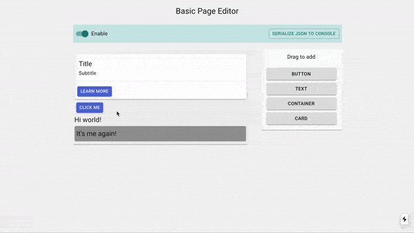
Let's design a section that is going to contain a switch for users to disable the editor's functionality and also a button that is simply going to display the serialized output in the browser's console.
// components/Topbar.tsx

import React from 'react';
import Box from '@mui/material/Box';
import Grid from '@mui/material/Grid';
import MaterialButton from '@mui/material/Button';
import FormControlLabel from '@mui/material/FormControlLabel';
import Switch from '@mui/material/Switch';

export const Topbar = () => {
  return (
    <Box px={1} py={1} mt={3} mb={1} bgcolor="#cbe8e7">
      <Grid container alignItems="center">
        <Grid item xs>
          <FormControlLabel
            control={<Switch checked={true} />}
            label="Enable"
          />
        </Grid>
        <Grid item>
          <MaterialButton size="small" variant="outlined" color="secondary">Serialize JSON to console</MaterialButton>
        </Grid>
      </Grid>
    </Box>
  )
};
Putting it all together
Now, let's put together our entire React application.
// pages/index.tsx
import React from 'react';
import Typography from '@mui/material/Typography';
import Paper from '@mui/material/Paper';
import Grid from '@mui/material/Grid';
import { Toolbox } from '../components/Toolbox';
import { SettingsPanel } from '../components/SettingsPanel';
import { Topbar } from '../components/Topbar';
import { Container } from '../components/user/Container';
import { Button } from '../components/user/Button';
import { Card } from '../components/user/Card';
import { Text } from '../components/user/Text';
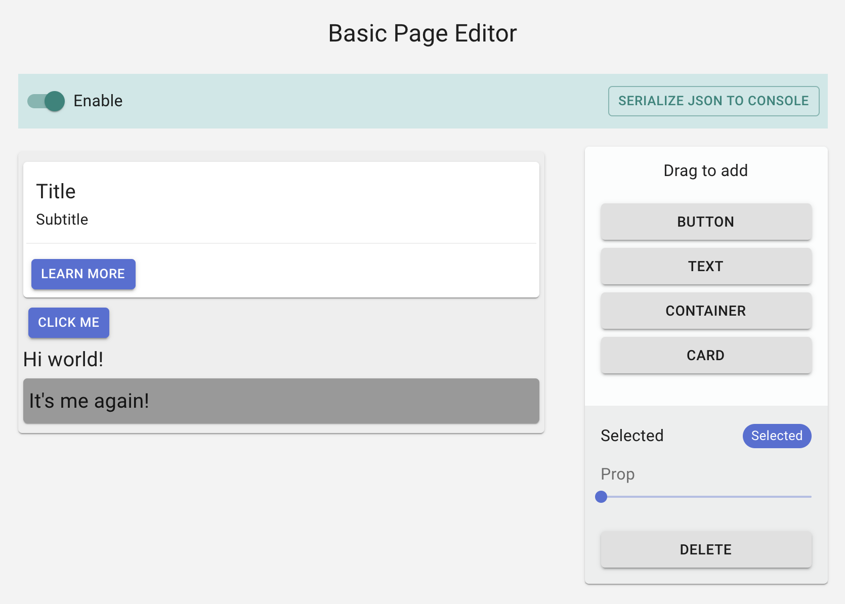
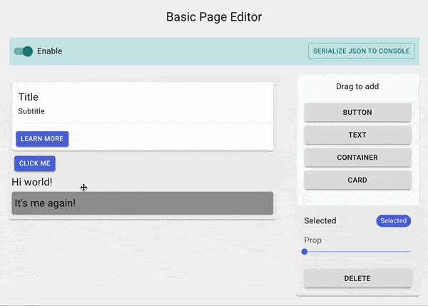
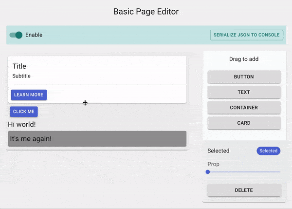
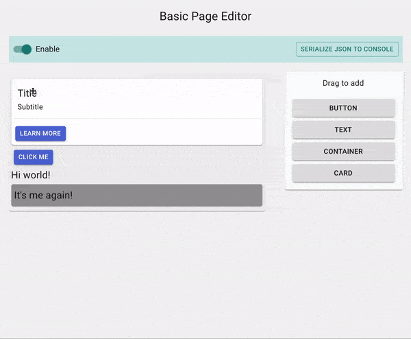
export default function App() {
return (
<div style={{margin: "0 auto", width: "800px"}}>
<Typography variant="h5" align="center">A super simple page editor</Typography>
<Grid container spacing={3} style={{paddingTop: "10px"}}>
<Topbar />
<Grid item xs>
<Container padding={5} background="#eee">
<Card />
</Container>
</Grid>
<Grid item xs={3}>
<Paper>
<Toolbox />
<SettingsPanel />
</Paper>
</Grid>
</Grid>
</div>
);
}
Implementing Editor
Up to this point, we have made a user interface for our page editor. Now, let's get it to work!
Setup
- First wrap our application with
<Editor />which sets up the Editor's context. We'll also need to specify the list of user components in theresolverprop for WebStencils to be able to (de)serialize our User Components. - Then wrap the editable area with
<Frame />which passes the rendering process to WebStencils.
// pages/index.tsx

import React from 'react';
import Typography from '@mui/material/Typography';
import Paper from '@mui/material/Paper';
import Grid from '@mui/material/Grid';

import { Toolbox } from '../components/Toolbox';
import { SettingsPanel } from '../components/SettingsPanel';

import { Container } from '../components/user/Container';
import { Button } from '../components/user/Button';
import { Card } from '../components/user/Card';
import { Text } from '../components/user/Text';

import { Editor, Frame, Element } from "@webstencils/core";

export default function App() {
  return (
    <div>
      <Typography variant="h5" align="center">A super simple page editor</Typography>
        <Editor resolver={{Card, Button, Text, Container}}>
          <Grid container spacing={3}>
            <Grid item xs>
              <Frame>
                <Container padding={5} background="#eee">
                  <Card />
                  <Button size="small" variant="outlined">Click</Button>
                  <Text size="small" text="Hi world!" />
                  <Container padding={6} background="#999">
                    <Text size="small" text="It's me again!" />
                  </Container>
                </Container>
              </Frame>
            </Grid>
            <Grid item xs={3}>
              <Paper className={classes.root}>
                  <Toolbox />
                  <SettingsPanel />
              </Paper>
            </Grid>
          </Grid>
        </Editor>
    </div>
  );
}
Every element that is rendered in <Frame /> is managed by an object in the editor's internal state called a Node which describes the element, its events, and props among other things.
Whether an element is draggable or droppable (or neither) depends on the type of Node that manages it.
- If the
Nodeis a Canvas, then it's droppable - If the
Nodeis an immediate child of a Canvas, then it's draggable.
By default, every element inside the <Frame /> will have a non-Canvas Node automatically defined for it:
// Explanation
<Frame>
  <Container padding={5} background="#eee"> // Node of type Container
    <Card /> // Node of type Card
    <Button size="small" variant="outlined">Click</Button> // Node of type Button
    <Text size="small" text="Hi world!" /> // Node of type Text
    <Container padding={2} background="#999"> // Node of type Container
       <Text size="small" text="It's me again!" /> // Node of type Text
    </Container>
  </Container>
</Frame>
Hence, by default, all the Nodes above are neither draggable nor droppable. So how can we define some of the Nodes above as a Canvas Node?
We can use the provided <Element /> component to manually define Nodes:
<Frame>
  <Element is={Container} padding={5} background="#eee" canvas> // Canvas Node of type Container, droppable
    <Card /> // Node of type Card
    <Button size="small" variant="outlined">Click</Button> // Node of type Button, draggable
    <Text size="small" text="Hi world!" /> // Node of type Text, draggable
    <Element is={Container} padding={2} background="#999" canvas> // Canvas Node of type Container, droppable and draggable
       <Text size="small" text="It's me again!" /> // Node of type Text, draggable
    </Element>
  </Element>
</Frame>
In the above code, we've wrapped our Container components with <Element /> with the canvas prop, thus making the component droppable and its immediate children, draggable.
Once you've applied these changes and refresh the page, you will notice that absolutely nothing has changed - and that's a good thing!
Enabling Drag and Drop
Inside a User Component, we have access to the useNode hook which provides some information and methods related to the corresponding Node.
The first thing we will need to do is to let WebStencils to manage the DOM of our component.
The hook provides connectors which act as a bridge between the DOM and the events in WebStencils:
// components/user/Text.tsx
import React from 'react';
import Typography from '@mui/material/Typography';
import { useNode } from '@webstencils/core';

export const Text = ({text}) => {
  const { connectors: {connect, drag} } = useNode();
  return (
     <div
      ref={ref => connect(drag(ref))}
    >
      <p>{text}</p>
    </div>
  )
}
Let's break this down a little:
- We passed the
connectconnector to the root element of our component; this tells WebStencils that this element represents the Text component. If the component's corresponding Node is a Canvas, then this also defines the area that is droppable. - Then, we also passed
dragconnector to the same root element; this adds the drag handlers to the DOM. If the component's Node is a child of a Canvas, then the user will be able to drag this element, and it will move the entire Text component.
We can also specify additional configuration to our component via the craft prop.
Let's define drag-n-drop rules for our Text Component:
export const Text = () => {/*...*/}
Text.craft = {
  // ...
  rules: {
    canDrag: (node) => node.data.props.text != "Drag"
  }
}
Our Text component can now only be dragged if the text prop is not set to "Drag" 🤪
Nice, now let's enable drag-n-drop for the other User Components:
// components/user/Button.tsx

export const Button = ({size, variant, color, children}) => {
  const { connectors: {connect, drag} } = useNode();
  return (
    <MaterialButton ref={ ref => connect(drag(ref))} size={size} variant={variant} color={color}>
      {/*...*/}
    </MaterialButton>
  )
}
// components/user/Container.tsx

export const Container = ({background, padding = 0, children}) => {
  const { connectors: {connect, drag} } = useNode();
  return (
    <Paper ref={ref=> connect(drag(ref))} style={{ background, padding: `${padding}px`}}>
      {/*...*/}
    </Paper>
  )
}
// components/user/Card.tsx (No changes)

// It's not necessary to add connectors for our Card component since it's a composition of our Container component - which already has connectors applied.
export const Card = ({background, padding = 0}) => {
  return (
    <Container background={background} padding={padding}>
      {/*...*/}
    </Container>
  )
}
At this point, you could refresh the page, and you would be able to drag stuff around.

Defining Droppable regions
Of course, our Card component is supposed to have 2 droppable regions, which means we'll need 2 Canvas nodes.
But hold up, how do we even create a Node inside a User Component? Remember the <Element /> component that was used to define Nodes earlier in our application? Well it can be used here as well.
// components/user/Card.tsx

import {useNode, Element} from "@webstencils/core";

export const Card = ({bg, padding}) => {
  return (
    <Container background={background} padding={padding}>
      <Element id="text" canvas> // Canvas Node of type div
        <Text text="Title" fontSize={20} />
        <Text text="Subtitle" fontSize={15} />
      </Element>
      <Element id="buttons" canvas> // Canvas Node of type div
        <Button size="small" text="Learn more" />
      </Element>
    </Container>
  )
}
<Element />used inside User Component must specify anidprop
You might be wondering how do we set drag/drop rules for the new droppable regions we made. Currently, we have set the is prop in our <Element /> to a div, but we can actually point it to a User Component.
Hence, we can specify and create a new User Component and define rules via the craft prop just like what we have done previously.
// components/user/Card.tsx

import React  from 'react';
import Text from "./Text";
import Button from "./Button";
import { Element, useNode } from "@webstencils/core";

import { Container }  from "./Container";

// Notice how CardTop and CardBottom do not specify the drag connector. This is because we won't be using these components as draggables; adding the drag handler would be pointless.

export const CardTop = ({children}) => {
  const { connectors: {connect} } = useNode();
  return (
    <div ref={connect} className="text-only">
      {children}
    </div>
  )
}

CardTop.craft = {
  rules: {
    // Only accept Text
    canMoveIn: (incomingNodes) => incomingNodes.every(incomingNode => incomingNode.data.type === Text)
  }
}

export const CardBottom = ({children}) => {
  const { connectors: {connect} } = useNode();
  return (
    <div ref={connect}>
      {children}
    </div>
  )
}

CardBottom.craft = {
  rules: {
    // Only accept Buttons
    canMoveIn : (incomingNodes) => incomingNodes.every(incomingNode => incomingNode.data.type === Button)
  }
}

export const Card = ({background, padding = 20}) => {
  return (
    <Container background={background} padding={padding}>
      <Element id="text" is={CardTop} canvas> // Canvas Node of type CardTop
        <Text text="Title" fontSize={20} />
        <Text text="Subtitle" fontSize={15} />
      </Element>
      <Element id="buttons" is={CardBottom} canvas> // Canvas Node of type CardBottom
        <Button size="small" text="Learn more" />
      </Element>
    </Container>
  )
}
Remember that every User Component must be added to our resolver, so let's add CardTop and CardBottom:
export default function App() {
  return (
        <Editor
          resolver={{Card, Button, Text, CardTop, CardBottom}}
        >
        </Editor>
  );
}

Implementing the Toolbox
Let's go back to our Toolbox component and modify it so that dragging those buttons into the editor will create new instances of the user components they represent.
Just as useNode provides methods and information related to a specific Node, useEditor specifies methods and information related to the entire editor's state.
The useEditor also provides connectors; the one we are interested in right now is create which attaches a drag handler to the
DOM specified in its first argument and creates the element specified in its second argument.
// components/Toolbox.tsx

import React from 'react';
import Box from '@mui/material/Box';
import Typography from '@mui/material/Typography';
import Grid from '@mui/material/Grid';
import MaterialButton from '@mui/material/Button';
import { Element, useEditor } from '@webstencils/core';
import { Container } from './user/Container';
import { Card } from './user/Card';
import { Button } from './user/Button';
import { Text } from './user/Text';

export const Toolbox = () => {
  const { connectors, query } = useEditor();

  return (
    <Box px={2} py={2}>
      <Grid container direction="column"  alignItems="center" justify="center" spacing={1}>
        <Box pb={2}>
          <Typography>Drag to add</Typography>
        </Box>
        <Grid container direction="column" item>
          <MaterialButton ref={ref=> connectors.create(ref, <Button text="Click me" size="small" />)} variant="contained">Button</MaterialButton>
        </Grid>
        <Grid container direction="column" item>
          <MaterialButton ref={ref=> connectors.create(ref, <Text text="Hi world" />)} variant="contained">Text</MaterialButton>
        </Grid>
        <Grid container direction="column" item>
          <MaterialButton ref={ref=> connectors.create(ref, <Element is={Container} padding={20} canvas />)} variant="contained">Container</MaterialButton>
        </Grid>
        <Grid container direction="column" item>
          <MaterialButton ref={ref=> connectors.create(ref, <Card />)} variant="contained">Card</MaterialButton>
        </Grid>
      </Grid>
    </Box>
  )
};
Notice for our Container component, we wrapped it with the <Element canvas /> - this will allow our users to drag and drop a new Container component that is droppable.
Now, you can drag and drop the Buttons, and they will actually create new instances of our User Components.
Making the components editable
Up until this point, we have a page editor where our users can move elements around. But, we are missing one important thing - enabling our users to edit the components' props.
The useNode hook provides us with the method setProp which can be used to manipulate a component's props. Let's implement a content editable for our Text Component:
For simplicity's sake, we will be using react-contenteditable
import React, {useCallback} from 'react';
import ContentEditable from 'react-contenteditable';

export const Text = ({text, fontSize}) => {
  const { connectors: {connect, drag}, actions: {setProp} } = useNode();

  return (
     <div
      ref={ref => connect(drag(ref))}
    >
      <ContentEditable
        html={text}
        onChange={e =>
          setProp(props =>
            props.text = e.target.value.replace(/<\/?[^>]+(>|$)/g, "")
          )
        }
        tagName="p"
        style={{fontSize: `${fontSize}px`, textAlign}}
      />
    </div>
  )
}
But let's only enable content editable only when the component is clicked when it's already selected; a double click is essential.
The useNode hook accepts a collector function which can be used to retrieve state information related to the corresponding Node:
// components/user/Text.tsx

export const Text = ({text, fontSize}) => {
  const { connectors: {connect, drag}, hasSelectedNode, hasDraggedNode, actions: {setProp} } = useNode((state) => ({
    hasSelectedNode: state.events.selected.size > 0,
    hasDraggedNode: state.events.dragged.size > 0
  }));

  const [editable, setEditable] = useState(false);

  useEffect(() => {!hasSelectedNode && setEditable(false)}, [hasSelectedNode]);

  return (
     <div
      ref={ref => connect(drag(ref))}
      onClick={e => setEditable(true)}
    >
      <ContentEditable
        disabled={!editable}
        /*...*/
      />
    </div>
  )
}
This should give you an idea of the possibilities of implementing powerful visual editing features like what you'd see in most modern page editors.
While we are at it, let's also add a slider for users to edit the fontSize
// components/user/Text.tsx

import Slider from '@mui/material/Slider';
import FormControl from '@mui/material/FormControl';
import FormLabel from '@mui/material/FormLabel';

export const Text= ({text, fontSize, textAlign}) => {
  const { connectors: {connect, drag}, hasSelectedNode, hasDraggedNode, actions: {setProp} } = useNode((state) => ({
    hasSelectedNode: state.events.selected.size > 0,
    hasDraggedNode: state.events.dragged.size > 0
  }));

  {/*...*/}

  return (
    <div {/*...*/}>
      <ContentEditable {/*...*/} />
      {
        hasSelectedNode && (
          <FormControl className="text-additional-settings" size="small">
            <FormLabel component="legend">Font size</FormLabel>
            <Slider
              defaultValue={fontSize}
              step={1}
              min={7}
              max={50}
              valueLabelDisplay="auto"
              onChange={(_, value) => {
                setProp(props => props.fontSize = value);
              }}
            />
          </FormControl>
        )
      }
    </div>
  )
}
We can agree that it does not look all that good since it obstructs the user experience.
Wouldn't it be better if the entire .text-additional-settings Grid is relocated to the Settings Panel that we created earlier?
The question is, how will the Settings Panel be able to render the .text-additional-settings when our Text component is selected?
This is where Related Components become useful.
Essentially, a Related Component shares the same Node context as our actual User component;
it can make use of the useNode hook. Additionally, a Related Component is registered to a component's Node,
which means we can access and render this component anywhere within the editor.
// components/user/Text.tsx

export const Text = ({text, fontSize}) => {
  const { connectors: {connect, drag}, isActive, actions: {setProp} } = useNode((node) => ({
    isActive: node.events.selected
  }));

  // ...

  return (
    <div {/*...*/}>
      <ContentEditable {/*...*/} />
    </div>
  )
}

const TextSettings = () => {
  const { actions: {setProp}, fontSize } = useNode((node) => ({
    fontSize: node.data.props.fontSize
  }));

  return (
    <>
      <FormControl size="small" component="fieldset">
        <FormLabel component="legend">Font size</FormLabel>
        <Slider
          value={fontSize || 7}
          step={7}
          min={1}
          max={50}
          onChange={(_, value) => {
            setProp(props => props.fontSize = value);
          }}
        />
      </FormControl>
    </>
  )
}

Text.craft = {
  // ...
  related: {
    settings: TextSettings
  }
}
Before we move on to the Settings Panel, let's quickly do the same for the other User Components:
// components/user/Button.tsx

import MaterialButton from '@mui/material/Button';
import Grid from '@mui/material/Grid';
import FormControl from '@mui/material/FormControl';
import FormLabel from '@mui/material/FormLabel';
import FormControlLabel from '@mui/material/FormControlLabel';
import RadioGroup from '@mui/material/RadioGroup';
import Radio from '@mui/material/Radio';

export const Button = () => {/*...*/};

const ButtonSettings = () => {
  const { actions: {setProp}, props } = useNode((node) => ({
    props: node.data.props
  }));

  return (
    <div>
      <FormControl size="small" component="fieldset">
        <FormLabel component="legend">Size</FormLabel>
        <RadioGroup defaultValue={props.size} onChange={(e) => setProp(props => props.size = e.target.value )}>
          <FormControlLabel label="Small" value="small" control={<Radio size="small" color="primary" />} />
          <FormControlLabel label="Medium" value="medium" control={<Radio size="small" color="primary" />} />
          <FormControlLabel label="Large" value="large" control={<Radio size="small" color="primary" />} />
        </RadioGroup>
      </FormControl>
      <FormControl component="fieldset">
        <FormLabel component="legend">Variant</FormLabel>
        <RadioGroup defaultValue={props.variant} onChange={(e) => setProp(props => props.variant = e.target.value )}>
          <FormControlLabel label="Text" value="text" control={<Radio size="small" color="primary" />} />
          <FormControlLabel label="Outlined" value="outlined" control={<Radio size="small" color="primary" />} />
          <FormControlLabel label="Contained" value="contained" control={<Radio size="small" color="primary" />} />
        </RadioGroup>
      </FormControl>
      <FormControl component="fieldset">
        <FormLabel component="legend">Color</FormLabel>
        <RadioGroup defaultValue={props.color} onChange={(e) => setProp(props => props.color = e.target.value )}>
          <FormControlLabel label="Default" value="default" control={<Radio size="small" color="default" />} />
          <FormControlLabel label="Primary" value="primary" control={<Radio size="small" color="primary" />} />
          <FormControlLabel label="Seconday" value="secondary" control={<Radio size="small" color="primary" />} />
        </RadioGroup>
      </FormControl>
    </div>
  )
};

Button.craft = {
  related: {
    settings: ButtonSettings
  }
}
// components/user/Container.tsx

import FormControl from '@mui/material/FormControl';
import FormLabel from '@mui/material/FormLabel';
import Slider from '@mui/material/Slider';

import { MuiColorInput as ColorPicker } from 'mui-color-input';

export const Container = () => {/*...*/};

export const ContainerSettings = () => {
  const { background, padding, actions: {setProp} } = useNode(node => ({
    background: node.data.props.background,
    padding: node.data.props.padding
  }));
  return (
    <div>
      <FormControl fullWidth={true} margin="normal" component="fieldset">
        <FormLabel component="legend">Background</FormLabel>
        <ColorPicker defaultValue={background || '#000'} onChange={color => {
          setProp(props => props.background = color)
        }} />
      </FormControl>
      <FormControl fullWidth={true} margin="normal" component="fieldset">
        <FormLabel component="legend">Padding</FormLabel>
        <Slider defaultValue={padding} onChange={(_, value) => setProp(props => props.padding = value)} />
      </FormControl>
    </div>
  )
}

Container.craft = {
  related: {
    settings: ContainerSettings
  }
}
// components/user/Card.tsx

import { ContainerSettings } from './Container';

export const Card = ({ background, padding = 20 }) => { /*...*/ };

Card.craft = {
  related: {
    // Since Card has the same settings as Container, we'll just reuse ContainerSettings
    settings: ContainerSettings
  }
}
Setting default props
Setting default props is not strictly necessary. However, it is helpful if we wish to access the component's props via its corresponding Node, like what we did in the settings related component above.
For instance, if a Text component is rendered as <Text text="Hi" />, we would get a null value when we try to retrieve the fontSize prop via its Node. An easy way to solve this is to explicitly define each User Component's props:
// components/user/Text.tsx

export const Text = ({text, fontSize}) => {/*...*/};

Text.craft = {
  props: {
    text: "Hi",
    fontSize: 20
  },
  rules: {...},
  related: {...}
}
// components/user/Button.tsx

export const Button = ({size, variant, color, text}) => {/*...*/};

Button.craft = {
  props: {
    size: "small",
    variant: "contained",
    color: "primary",
    text: "Click me"
  },
  related: {...}
}
// components/user/Container.tsx

export const Container = ({background, padding}) => {/*...*/};

// We export this because we'll be using this in the Card component as well
export const ContainerDefaultProps = {
  background : "#ffffff",
  padding: 3
};

Container.craft = {
  props: ContainerDefaultProps,
  related: {...}
};
// components/user/Card.tsx

import {ContainerDefaultProps} from './Container';

export const Card = ({background, padding}) => {/*...*/};

Card.craft = {
  props: ContainerDefaultProps,
  related: {...}
};
Settings Panel
We need to get the currently selected component which can be obtained from the editor's internal state. Similar to useNode, a collector function can be specified to useEditor. The difference is here, we'll be dealing with the editor's internal state rather than with a specific Node:
const { currentlySelectedId } = useEditor((state) => {
  const [currentlySelectedId] = state.events.selected;

  return {
    currentlySelectedId
  }
})
Note: state.events.selected is of type
Set<string>. This is because in the case of multi-select, it's possible for the user to select multiple Nodes by holding down the<meta>key.
Now, let's replace the placeholder text fields in our Settings Panel with the settings Related Component:
// components/SettingsPanel.tsx

import Box from '@mui/material/Box';
import Grid from '@mui/material/Grid';
import Typography from '@mui/material/Typography';
import Chip from '@mui/material/Chip';
import MaterialButton from '@mui/material/Button';

import { useEditor } from "@webstencils/core";

export const SettingsPanel = () => {
  const { selected } = useEditor((state) => {
    const [currentNodeId] = state.events.selected;
    let selected;

    if ( currentNodeId ) {
      selected = {
        id: currentNodeId,
        name: state.nodes[currentNodeId].data.name,
        settings: state.nodes[currentNodeId].related && state.nodes[currentNodeId].related.settings
      };
    }

    return {
      selected
    }
  });

  return selected ? (
    <Box bgcolor="rgba(0, 0, 0, 0.06)" mt={2} px={2} py={2}>
      <Grid container direction="column" spacing={0}>
        <Grid item>
          <Box pb={2}>
            <Grid container alignItems="center">
              <Grid item xs><Typography variant="subtitle1">Selected</Typography></Grid>
              <Grid item><Chip size="small" color="primary" label={selected.name} /></Grid>
            </Grid>
          </Box>
        </Grid>
        {
          selected.settings && React.createElement(selected.settings)
        }
        <MaterialButton
          variant="contained"
          color="default"
        >
          Delete
        </MaterialButton>
      </Grid>
    </Box>
  ) : null
}
Now, we have to make our Delete button work. We can achieve this by using the delete action available from the useEditor hook.
Also, it's important to note that not all nodes are deletable - if we try to delete an undeletable Node, it'll result in an error. Hence, it's good to make use of the helper methods which helps describe a Node. In our case, we would like to know if the currently selected Node is deletable before actually displaying the "Delete" button. We can access the helper methods via the node query in the useEditor hook.
// components/SettingsPanel.tsx

export const SettingsPanel = () => {
  const { actions, selected } = useEditor((state, query) => {
    const [currentNodeId] = state.events.selected;
    let selected;

    if ( currentNodeId ) {
      selected = {
        id: currentNodeId,
        name: state.nodes[currentNodeId].data.name,
        settings: state.nodes[currentNodeId].related && state.nodes[currentNodeId].related.settings,
        isDeletable: query.node(currentNodeId).isDeletable()
      };
    }

    return {
      selected
    }
  });

  return selected ? (
    <Box bgcolor="rgba(0, 0, 0, 0.058823529411764705)" mt={2} px={2} py={2}>
      <Grid container direction="column" spacing={0}>
        ...
        {
          selected.isDeletable ? (
            <MaterialButton
              variant="contained"
              color="default"
              onClick={() => {
                actions.delete(selected.id);
              }}
            >
              Delete
            </MaterialButton>
          ) : null
        }
      </Grid>
    </Box>
  ) : null
}
Topbar
This is the last part of the editor that we have to take care of, and then we're done!
First, we can get the editor's enabled state by passing in a collector function just like what we did before. Then, we can use the setOptions action to toggle the enabled state.
Lastly, the useEditor hook also provides query methods which provide information based the editor state.
In our case, we would like to get the current state of all the Nodes in a serialized form; we can do this by calling the serialize query method.
// components/Topbar.tsx

import React from 'react';
import Box from '@mui/material/Box';
import Grid from '@mui/material/Grid';
import MaterialButton from '@mui/material/Button';
import FormControlLabel from '@mui/material/FormControlLabel';
import Switch from '@mui/material/Switch';

import { useEditor } from "@webstencils/core";

export const Topbar = () => {
  const { actions, query, enabled } = useEditor((state) => ({
    enabled: state.options.enabled
  }));

  return (
    <Box px={1} py={1} mt={3} mb={1} bgcolor="#cbe8e7">
      <Grid container alignItems="center">
        <Grid item xs>
          <FormControlLabel
            control={<Switch checked={enabled} onChange={(_, value) => actions.setOptions(options => options.enabled = value)} />}
            label="Enable"
          />
        </Grid>
        <Grid item>
          <MaterialButton
            size="small"
            variant="outlined"
            color="secondary"
            onClick={() => {
              console.log(query.serialize())
            }}
          >
              Serialize JSON to console
          </MaterialButton>
        </Grid>
      </Grid>
    </Box>
  )
};
We'll explore how to compress the JSON output and have the editor load from the serialised JSON in the Save and Load guide.
You made it
We've made it to the end! Not too bad right? Hopefully, you're able to see the simplicity of building a fully working page editor with WebStencils.
We do not need to worry about implementing the drag-n-drop system but rather simply focus on writing rules and attaching connectors to the desired elements.
When it comes to writing the components themselves, it is the same as writing any other React component - you control how the components react to different editor events and how they are edited.
Save and Load
This guide extends upon the Basic Tutorial
Overview
Previously, we saw how we could serialize the entire state of Nodes in our editor into JSON. Of course, you probably will not want to store the JSON in your server or database, for obvious reasons. Instead, you should first employ a text compression technique of your choice to compress the serialized JSON Nodes.
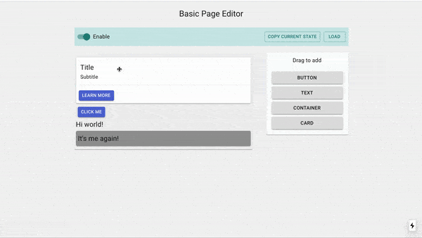
In this guide, we'll be mainly modifying the previous tutorial's Topbar component. We'll add 2 new features
- Copy the compressed output of the serialized Nodes to the user's clipboard
- Load the editor state from a compressed output of serialized Nodes.
We'll be using 2 external libraries - lzutf8 (for compression) and copy-to-clipboard (you know)
yarn add lzutf8 copy-to-clipboard
Copy compressed output
We'll use lzutf8 to compress our serialised JSON Nodes, and additionally transform it into base64.
import React, { useState } from 'react';

import Box from '@mui/material/Box';
import MaterialButton from '@mui/material/Button';
import Grid from '@mui/material/Grid';
import Switch from '@mui/material/Switch';
import FormControlLabel from '@mui/material/FormControlLabel';
import Dialog from '@mui/material/Dialog';
import DialogTitle from '@mui/material/DialogTitle';
import DialogContent from '@mui/material/DialogContent';
import DialogContentText from '@mui/material/DialogContentText';
import DialogActions from '@mui/material/DialogActions';
import TextField from '@mui/material/TextField';
import Snackbar from '@mui/material/Snackbar';

import { useEditor } from '@webstencils/core';
import lz from 'lzutf8';
import copy from 'copy-to-clipboard';

export const Topbar = () => {
  const { actions, query, enabled } = useEditor((state) => ({
    enabled: state.options.enabled
  }));

  const [snackbarMessage, setSnackbarMessage] = useState();

  return (
    <Box px={1} py={1} mt={3} mb={1} bgcolor="#cbe8e7">
      <Grid container alignItems="center">
        <Grid item xs>
          <FormControlLabel
            className="enable-disable-toggle"
            control={<Switch checked={enabled} onChange={(_, value) => actions.setOptions(options => options.enabled = value)} />}
            label="Enable"
          />
        </Grid>
        <Grid item>
          <MaterialButton
            className="copy-state-btn"
            size="small"
            variant="outlined"
            color="secondary"
            onClick={() => {
              const json = query.serialize();
              copy(lz.encodeBase64(lz.compress(json)));
              setSnackbarMessage("State copied to clipboard")
            }}
          >
              Copy current state
          </MaterialButton>
          <Snackbar
            autoHideDuration={1000}
            anchorOrigin={{ vertical: "bottom", horizontal: "center" }}
            open={!!snackbarMessage}
            onClose={() => setSnackbarMessage(null)}
            message={<span>{snackbarMessage}</span>}
          />
        </Grid>
      </Grid>
    </Box>
  )
};
When you click on the button now, it should copy the compressed base64 string to the clipboard.
Load state
Now let's implement the Load State button in our Topbar component. We will display a Dialog box when the button is clicked, and our users will be able to paste the compressed base64 string there.
Then, we will need to work in reverse to obtain the original JSON provided by our editor.
Finally, we'll call the deserialize action which will result in the editor replacing all the current Nodes in the editor with the deserialized output.
import React, { useState } from 'react';

import Box from '@mui/material/Box';
import Grid from '@mui/material/Grid';
import MaterialButton from '@mui/material/Button';
import Switch from '@mui/material/Switch';
import FormControlLabel from '@mui/material/FormControlLabel';
import Dialog from '@mui/material/Dialog';
import DialogTitle from '@mui/material/DialogTitle';
import DialogContent from '@mui/material/DialogContent';
import DialogContentText from '@mui/material/DialogContentText';
import DialogActions from '@mui/material/DialogActions';
import TextField from '@mui/material/TextField';
import Snackbar from '@mui/material/Snackbar';

import { useEditor } from '@webstencils/core';
import lz from 'lzutf8';
import copy from 'copy-to-clipboard';

export const Topbar = () => {
  const { actions, query, enabled } = useEditor((state) => ({
    enabled: state.options.enabled
  }));

  const [dialogOpen, setDialogOpen] = useState(false);
  const [snackbarMessage, setSnackbarMessage] = useState();
  const [stateToLoad, setStateToLoad] = useState(null);

  return (
    <Box px={1} py={1} mt={3} mb={1} bgcolor="#cbe8e7">
      <Grid container alignItems="center">
        <Grid item xs>
          <FormControlLabel
            className="enable-disable-toggle"
            control={<Switch checked={enabled} onChange={(_, value) => actions.setOptions(options => options.enabled = value)} />}
            label="Enable"
          />
        </Grid>
        <Grid item>
          <MaterialButton
            className="copy-state-btn"
            size="small"
            variant="outlined"
            color="secondary"
            onClick={() => {
              const json = query.serialize();
              copy(lz.encodeBase64(lz.compress(json)));
              setSnackbarMessage("State copied to clipboard")
            }}
          >
              Copy current state
          </MaterialButton>
          <MaterialButton
            className="load-state-btn"
            size="small"
            variant="outlined"
            color="secondary"
            onClick={() => setDialogOpen(true)}
          >
              Load
          </MaterialButton>
          <Dialog
            open={dialogOpen}
            onClose={() => setDialogOpen(false)}
            fullWidth
            maxWidth="md"
          >
            <DialogTitle id="alert-dialog-title">Load state</DialogTitle>
            <DialogContent>
              <TextField
                multiline
                fullWidth
                placeholder='Paste the contents that was copied from the "Copy Current State" button'
                size="small"
                value={stateToLoad}
                onChange={e => setStateToLoad(e.target.value)}
              />
            </DialogContent>
            <DialogActions>
              <MaterialButton onClick={() => setDialogOpen(false)} color="primary">
                Cancel
              </MaterialButton>
              <MaterialButton
                onClick={() => {
                  setDialogOpen(false);
                  const json = lz.decompress(lz.decodeBase64(stateToLoad));
                  actions.deserialize(json);
                  setSnackbarMessage("State loaded")
                }}
                color="primary"
                autoFocus
              >
                Load
              </MaterialButton>
            </DialogActions>
          </Dialog>
          <Snackbar
            autoHideDuration={1000}
            anchorOrigin={{ vertical: "bottom", horizontal: "center" }}
            open={!!snackbarMessage}
            onClose={() => setSnackbarMessage(null)}
            message={<span>{snackbarMessage}</span>}
          />
        </Grid>
      </Grid>
    </Box>
  )
};
Load JSON on page load
Of course, what if we wanted our editor to load a serialized output on page load?
For this, we will need to take a step back and revisit the <Frame /> component which we encountered when we first set up WebStencils.
By default, it constructs the editor state based on what was initially rendered in its children.
But, we could also specify the serialized JSON nodes to its json prop which would cause it to load the state from the JSON string instead.
import React, { useState, useEffect } from 'react';
import "../styles/main.css";

import Typography from '@mui/material/Typography';
import MaterialButton from '@mui/material/Button';
import Paper from '@mui/material/Paper';
import Grid from '@mui/material/Grid';

import { Toolbox } from '../components/Toolbox';
import { Container } from '../components/user/Container';
import { Button } from '../components/user/Button';
import { Card, CardBottom, CardTop } from '../components/user/Card';
import { Text } from '../components/user/Text';
import { SettingsPanel } from '../components/SettingsPanel';
import { Editor, Frame, Element } from "@webstencils/core";
import { Topbar } from '../components/Topbar';

export default function App() {
  const [enabled, setEnabled] = useState(true);
  const [json, setJson] = useState(null);

  // Load save state from server on page load
  useEffect(async () => {
    const stateToLoad = await fetch("your api to get the compressed data");
    const json = lz.decompress(lz.decodeBase64(stateToLoad));
    setJson(json);
  }, []);

  return (
    <div style={{margin: "0 auto", width: "800px"}}>
      <Typography style={{margin: "20px 0"}} variant="h5" align="center">Basic Page Editor</Typography>
        <Editor
          resolver={{Card, Button, Text, Container, CardTop, CardBottom}}
          enabled={enabled}
        >
          <Topbar />
          <Grid container spacing={5} style={{paddingTop: "10px"}}>
            <Grid item xs>
              <Frame data={json}>
                <Element is={Container} padding={5} background="#eeeeee">
                  {/*...*/}
                </Element>
              </Frame>
            </Grid>
            <Grid item xs={4}>
              {/*...*/}
            </Grid>
          </Grid>
        </Editor>
    </div>
  );
}
All set!
Now, play with the editor and press the Copy Current State button when you are done. Refresh the page so the editor returns to its default state, then press the Load State button and paste the copied output - you should see the editor displaying the elements in the state from the time you copied.
EditorState
Type
Reference
Properties
nodesRecord<NodeId, Node>: A map of all the Nodes in the editoreventsObjectselectedSet<NodeId>hoveredSet<NodeId>draggedSet<NodeId>
optionsObject (can be specified as props in the<Editor />)resolverMap<string, React.ComponentType>: A map of User Components that will be used in the editorenabled?boolean: Optional. If set to false, all editing capabilities will be disabledindicatorObjectsuccessstring: Color to use when the user hovers over a droppable locationerrorstring: Color to use when the user hovers over a non-droppable locationtransitionstring: CSS transition to use for when the Indicator moves aroundthicknessnumber: Thickness of the Indicator
onRender?React.ComponentType<{element: React.ReactElement}>: Optional. Specify a custom component to render every User Element in the editor.onNodesChange?() => void: Optional. A callback method when the values of the nodes in the state changes
Node
Type
Reference
Properties
idNodeId: A randomly generated unique iddataObjectpropsRecord<string, any>: The current props for the user elementtypeReact.ElementType: The type of User Elementnamestring: Name of the User ElementdisplayNamestring: By default, it will be set to the same value as 'name'. But User Components have the ability to opt for a more user-friendly name by setting thecraft.namepropertyisCanvasboolean: True if the current Node is a Canvas NodeparentNodeId: The parent Node's idnodesNodeId[]: The id of the child NodeshiddenbooleancustomRecord<String, any>: Custom properties stored in the NodelinkedNodesRecord<String, NodeId>: A map of Nodes defined inside the User Component. Only applicable if the current Node's User Element is a Component which contains <Element /> inside its render
eventsObjectselectedboolean: Is true if the user element is clickedhoveredboolean: Is true if the user element is being hovereddraggedboolean: Is true if the user element is being dragged
domHTMLElement | null: The DOM of the current Node's User Element. For User Components, this is defined by theconnectconnectorrelatedRecord<String, React.ElementType>: A map of React Components that shares the current Node contextrulesObjectcanDrag(currentNode: Node) => boolean: Specifies if the current Node can be dragged. Applicable only if the current Node is a direct child of a Canvas NodecanDrop(targetNode: Node, currentNode: Node) => boolean: Specifies if the current Node that is being dragged can be dropped in its target. Applicable only if the current Node is a direct child of a Canvas NodecanMoveIn(incomingNodes: Node[], currentNode: Node, helpers: NodeHelpers) => boolean: Specifies if an array of incoming Nodes can be dropped into the current component. Applicable only to components whose corresponding Node is a CanvascanMoveOut(outgoingNodes: Node[], currentNode: Node, helpers: NodeHelpers) => boolean: Specifies if an array of child Nodes can be dragged out of the current component. Applicable only to components whose corresponding Node is a Canvas
Examples
Basics
Simple elements
Example
<div style={{ background: "#eee" }}>Hello</div>
which gives the following tree:
{
  "node-a": {
    "id": "node-a",
    "data": {
      "type": "div",
      "props": {
        "style": {
          "background": "#eee"
        },
        "children": "Hello"
      },
      "name": "div",
      "displayName": "div",
      "isCanvas": false
    }
  }
}
User Component
Definition
const Container = () => {}

Container.craft = {
  name: "SimpleContainer"
};
Usage
<Container bg="#fff" />
Node tree:
{
  "node-b": {
    "id": "node-b",
    "data": {
      "type": "Container",
      "props": {
        "bg": "#fff"
      },
      "name": "Container",
      "displayName": "SimpleContainer",
      "isCanvas": false
    }
  }
}
Child Nodes
Nodes that are referenced in the parent Node's data.nodes property.
These nodes are rendered in the parent User Component's children prop
<Container bg="#fff">
  <h2>Hello</h2>
</Container>
Node tree:
{
  "node-a": {
    "id": "node-a",
    "data": {
      "type": "Container",
      "props": {},
      "nodes": ["node-b"]
    }
  },

  "node-b": {
    "id": "node-b",
    "data": {
      "type": "h2",
      "props": {},
      "parent": "node-a"
    }
  }
}
Linked nodes
Nodes that are linked to a parent Node via an arbitrary id
Definition:
const TextEditable = () => {};

const Container = () => {
  return (
    <div>
      <Element id="header" is={TextEditable} text="Header" />
    </div>
  )
}
Usage
<Container bg="#fff" />
Node tree:
{
  "node-a": {
    "id": "node-a",
    "data": {
      "type": "Container",
      "props": {},
      "linkedNodes": {
        "header": "node-b"
      }
    }
  },

  "node-b": {
    "id": "node-b",
    "data": {
      "type": "TextEditable",
      "props": {},
      "parent": "node-a"
    }
  }
}
Nodes with Custom properties
Definition
const Container = () => {/*...*/}

Container.craft = {
  custom: { // default custom values
    toSaveInDatabase: false
  }
};
Usage
<Element is={Container} bg="#fff" custom={{ toSaveInDatabase: true}} />
Node tree:
{
  "node-b": {
    "id": "node-b",
    "data": {
      "props": {
        "bg": "fff"
      },
      "custom": {
        "toSaveInDatabase": true
      }
    }
  }
}
UserComponent
Type
A wrapper of React.ComponentType<Props>.
Accepts a static craft property for configuring the User Component.
Reference
Properties
- React.ComponentType<T> &
craftObjectdisplayNamestring: A user-friendly name for the User Component. The value here will be used to set the node.data.displayName property.propsT: Specify default values for the props TcustomRecord<string, any>: Specify default custom values for the User ComponentrelatedRecord<string, React.ElementType>: A map of React Components to share the same Node context. This components will be able to access the useNode hookrules?ObjectcanDrag(currentNode: Node, helpers: NodeHelpers) => boolean: Specifies if the component can be dragged. Applicable only to components whose corresponding Node is a direct child of a CanvascanDrop(targetNode: Node, currentNode, helpers: NodeHelpers) => boolean: Specifies if the current Node that is being dragged can be dropped in its target. Applicable only if the current Node is a direct child of a Canvas NodecanMoveIn(incomingNodes: Node[], currentNode: Node, helpers: NodeHelpers) => boolean: Specifies if an array of incoming Nodes can be dropped into the current component. Applicable only to components whose corresponding Node is a CanvascanMoveOut(outgoingNodes: Node[], currentNode: Node, helpers: NodeHelpers) => boolean: Specifies if an array of child Nodes can be dragged out of the current component. Applicable only to components whose corresponding Node is a Canvas
Example
type TextProps = {
  color: string,
  text: string
};

const TextComponent: UserComponent<TextProps> = ({color, text}) => {
  return (
    <h2 style={{color}}>{text}</h2>
  )
}

const TextSettings = () => {
  const { props, actions: { setProp } } = useNode();

  return (
    <div>
      Text: <input type="text" value={props.text} onChange={e => setProp(props => props.text = e.target.value) }/>
      Color: <input type="text" value={props.color} onChange={e => setProp(props => props.color = e.target.value) }/>
    </div>
  )
}

TextComponent.craft = {
  displayName: "My Text Component",
  props: {
    color: "#000",
    text: "Hi"
  },
  rules: {
    canDrag: (self: Node, helper) => true,
    canMoveIn: (incoming: Node[], self: Node, helper) => true,
    canMoveOut: (outgoing: Node[], self: Node, helper) => true
  },
  related: {
    settings: TextSettings
  }
}
NodeTree
Type
A data structure that represents the hierarchy of a React Element instances as tree of Nodes.
Reference
Properties
rootNodeIdNodeId: The id of the root Node in the treenodesRecord<NodeId, Node> Nodes
Example
<div>
  <h2>Hello</h2>
  <h2>World</h2>
</div>
The NodeTree of the div is:
{
  "rootNodeId": "node-a",
  "nodes": {
    "node-a" : {
      "data": {
        "type": "div",
        "nodes": ["node-b", "node-c"]
      }
    },
    "node-b" : {
      "data": {
        "type": "h2",
        "props": { "children": "Hello" }
      }
    },
    "node-c" : {
      "data": {
        "type": "h2",
        "props": { "children": "World" }
      }
    }
  }
}
<Editor />
Component
Creates the context that stores the editor state.
Reference
Props
resolverMap<string, React.ComponentType>: A map of User Components that will be used in the editorenabled?boolean: Optional. If set to false, all editing capabilities will be disabledindicator?Record<"success" | "error", String>: Optional. The colour to use for the drop indicator. The color set insuccesswill be used when the indicator shows a droppable location; otherwise the color set inerrorwill be used.onRender?React.ComponentType<{element: React.ReactElement}>: Optional. Specify a custom component to render every User Element in the editor.onNodesChange?(query: EditorQueryMethods) => void: Optional. A callback method when the values of the nodes in the state changeshandlers?(store: EditorStore) => CoreEventHandlers: Optional. Override the default event handlers with your own logic.
Examples
Custom render user elements
By default, every user element is rendered just as it is.
However, if you'd like to, for example, wrap every user element inside a div, you can do so through the onRender prop:
import {Editor} from "@webstencils/core";

const RenderNode = ({element}) => {
  return (
    <div style={{background: "#000", padding: "5px" }}>
      {element}
    </div>
  )
}

const App = () => {
  return (
    <Editor onRender={RenderNode}>
      <Frame resolver={{Hero}}>
        <Element>
          <h1>Hi</h1>
          <Hero />
        </Element>
      </Frame>
    </Editor>
  )
}
In the above example, every user element will now be wrapped in a black div.
Specifying the Drop Indicator Color
You can change the colors of the drag and drop indicators like so:
import {Editor} from "@webstencils/core";

const App = () => {
  return (
    <Editor
      indicator={{
        'success': '#2d9d78', // green
        'error': '#e34850' // red
      }}
    >
      <Frame resolver={{Hero}}>
        <Element>
          <h1>Hi</h1>
          <Hero />
        </Element>
      </Frame>
    </Editor>
  )
}
Callback when Nodes change
Perform a callback whenever the Nodes in the editor is updated/changed
import {Editor} from "@webstencils/core";

const App = () => {
  return (
    <Editor
      // Save the updated JSON whenever the Nodes has been changed
      onNodesChange={query => {
        const json = query.serialize();
        // save to server
        axios.post('/saveJSON', { json });
      }}
    >
      {/*...*/}
    </Editor>
  )
}
Override default event handlers
Customize how the default event handlers are handled
import {
  DefaultEventHandlers,
  DefaultEventHandlersOptions,
  Editor,
  EditorStore,
  NodeId
} from '@webstencils/core'

class CustomEventHandlers extends DefaultEventHandlers {
  handlers() {
    const defaultHandlers = super.handlers()

    return {
      ...defaultHandlers,
      // Customize the hover event handler
      hover: (el, id) => {
        const unbindDefaultHoverHandler = defaultHandlers.hover(el, id)

        // Track when the mouse leaves a node and remove the hovered state
        const unbindMouseleave = this.addCraftEventListener(el, 'mouseleave', (e) => {
          e.craft.stopPropagation()
          this.options.store.actions.setNodeEvent('hovered', '')
          console.log(`mouseleave node ${id}`)
        })

        return () => {
          unbindDefaultHoverHandler();
          unbindMouseleave();
        }
      }
    }
  }
}

const App = () => {
  return (
    <Editor
      // Use your own event handlers
      handlers={(store) =>
        new CustomEventHandlers({ store, isMultiSelectEnabled: () => false })
      }
    >
      {/*...*/}
    </Editor>
  )
}
<Frame />
Component
Frame defines the editable area in your page editor. It is rendered based on the editor's internal state (i.e. Nodes).
const { connectors, actions, ...collected } = useNode(collector);
Reference
Props
Both props specify the initial screen to render.
You must specify at least one of them (data takes precedence over children).
children?React.ReactElement: Creates the initial screen using React Elements. The element defined here will be the Root Nodedata?SerializedNodes | string: Loads the initial nodes from SerializedNodes (can be supplied in JSON)
These props are memoized - after the initial render, changes to these props will have no effect.
If for example, you wish to load a different set of serialised JSON nodes after the initial render,
you may use the deserialize method via the useEditor hook.
Examples
With JSX
import { Editor, Frame, Element } from "@webstencils/core";

const App = () => {
  return (
    <div>
      <h2>My App!</h2>
      <Editor>
        <h2>My Page Editor</h2>
        <Frame>
          <Element is={Container} canvas> // defines the Root Node
            <h2>Drag me around</h2>
            <MyComp text="You can drag me around too" />
            <Element is="div" style={{background: "#333" }}>
              <p>Same here</p>
            </Element>
          </Element>
        </Frame>
      </Editor>
    </div>
  )
}
Loading from Serialized Nodes
import { Editor, Frame, Element } from "@webstencils/core";

const App = () => {
  return (
    <div>
      <h2>My App!</h2>
      <Editor>
        <h2>My Page Editor</h2>
        <Frame
          data='{"ROOT":{"type":"div","isCanvas":true,"props":{},"parent":null,"displayName":"div","custom":{},"nodes":["node-sdiwzXkvQ","node-rGFDi0G6m","node-yNBLMy5Oj"]},"node-sdiwzXkvQ":{"type":{"resolvedName":"Card"},"props":{},"parent":"ROOT","displayName":"Card","custom":{},"_childCanvas":{"main":"canvas-_EEw_eBD_","second":"canvas-lE4Ni9oIn"}}}'
        >
          <Element is={Container} canvas> // defines the Root Node
            <h2>Drag me around</h2>
            <MyComp text="You can drag me around too" />
            <Element is="div" style={{background: "#333" }}>
              <p>Same here</p>
            </Element>
          </Element>
        </Frame>
      </Editor>
    </div>
  )
}
<Element />
Component
Defines the Node for a given User Element
Reference
Props
isReact.ElementType: The User Element to renderidstring: Required if the <Element /> is being created inside a User Componentcanvasboolean: If true, a Canvas Node will be created.customRecord<string, any>: Sets the Node's custom propertieshiddenboolean: Sets the Node's hidden property. If true, this will hide the Node...elementPropsObject: The props of the element specified inis
Usage
Configure Nodes in <Frame />
Since the <Frame /> component creates a Node automatically for all of its children elements, thus the <Element /> component can be used to simply configure the values of the Node that is being created.
import {Craft, Frame, Element} from "@webstencils/core";

const App = () => {
  return (
    <div>
      <h2>My App!</h2>
      <Craft resolver={{MyComp}}>
        <h2>My Page Editor</h2>
        <Frame>
          <Element is="div" canvas> // defines the Root Node, droppable
            <h2>Drag me around</h2> // Node of type h2, draggable
            <MyComp text="You can drag me around too" /> // Node of type MyComp, draggable
            <Element is="div" style={{background: "#333" }} canvas> // Canvas Node of type div, draggable and droppable
              <p>Same here</p> // Not a Node; not draggable
            </Element>
          </Element>
        </Frame>
      </Craft>
    </div>
  )
}
Defining Linked Nodes
When used inside a User Component, <Element /> works identically as used inside <Frame /> but because there isn't a Node in-place,
thus it has to create a new Linked Node - which is essentially a Node that is linked to the Node of the containing User Component via an arbitrary id:
const Hero = () => {
  return (
    <div>
      <h3>I'm a Hero</h3>
      <Element id="drop" is={Container} canvas>
        <h3>Hi</h3>
      </Element>
    </div>
  )
}
<Element /> used inside User Component must specify an id prop
Examples
Setting custom properties
User Components may consume custom properties from their corresponding Node.
These properties essentially act like additional props.
Let's say we have a Hero component that has a css custom property and as usual, we set its default values via the craft property.
const Hero = () => {
  const { css } = useNode(node => ({
    css: node.data.custom.css
  }));

  return (
    <div style={css}>
      <h3>I'm a Hero</h3>
      <Element id="drop" is={Container} canvas>
        <h3>Hi</h3>
      </Element>
    </div>
  )
}

Hero.craft = {
  custom: {
    css: {
      background: "#eee"
    }
  }
}
Now, if you'd like to actually set these values when you call the component, you can do it like so:
<Frame>
  <Element is={Hero} custom={{
    css: {
      background: "#ddd"
    }
  }} />
</Frame>
useEditor()
Hook
A Hook that provides methods and state information associated with the entire editor.
const { connectors, actions, query, ...collected } = useEditor(collector);
Reference
Parameters
collector(state: EditorState, query: Query) => Collected: A function that collects relevant state information from the editor state. The component will re-render when the values returned by this function changes.
Returns
- Object
connectorsObjectselect(dom: HTMLElement, nodeId: NodeId) => HTMLElement: Specifies the DOM that when clicked will in turn click the specified Node's user componenthover(dom: HTMLElement, nodeId: NodeId) => HTMLElement: Specifies the DOM that when hovered will in turn hover the specified Node's user componentdrag(dom: HTMLElement, nodeId: NodeId) => HTMLElement: Specifies the DOM that when dragged will move the specified Node's user component. Only applicable if the component is rendered as an immediate child of a <Canvas /> component.create(dom: HTMLElement, userElement: React.ReactElement) => HTMLElement: Specifies the DOM that when dragged will create a new instance of the specified User Element at the drop location.
actionsActionMethodsadd(nodes: Node, parentId?: NodeId, index?: number) => void: Add a Node to the given parent node ID at the specified index. By default, the parentId is the id of the Root NodeaddNodeTree(tree: NodeTree, parentId?: NodeId) => void: Add a NodeTree to the given parent node ID at the specified index. By default, the parentId is the id of the Root NodeclearEvents() => void: Resets the editors events statedelete(nodeID: NodeId) => void: Delete the specified Nodedeserialize(data: SerializedNodes | string) => void: Recreate Nodes from a SerializedNodes object/json. This will clear all the current Nodes in the editor state with the recreated Nodesmove(nodeId: NodeId, targetParentId: NodeId, index: number) => void: Move a Node to the specified parent Node at the given index.setProp(nodeId: NodeId, update: (props: Object) => void) => void: Manipulate the props of the given NodesetCustom(nodeId: NodeId, update: (custom: Object) => void) => void: Manipulate the custom values of the given NodesetHidden(nodeId: NodeId, bool: boolean) => void: When set to true, the User Component of the specified Node will be hidden, but not removedsetOptions(options: Object) => void: Update the editor's options. The options object passed is the same as the <Editor /> props.selectNode(nodeId: NodeId | null) => void: Select the specified node. You can clear the selection by passingnullhistoryundo() => void: Undo the last recorded actionredo() => void: Redo the last undone actionignore() => ActionMethods: Run an action without recording its changes in the historythrottle(throttleRate: number = 500) => ActionMethods: Run an action while throttling its changes recorded to the history. This is useful if you need to group the changes made by a certain action as a single history record
queryEditorQueryMethodsgetSerializedNodes() => SerializedNodes: Return the current Nodes into a simpler form safe for storageserialize() => String: Return getSerializedNodes() in JSONgetOptions() => Object: Get the options specified in the <Editor /> componentgetDropPlaceholder(sourceNodeId: NodeId, targetNodeId: NodeId, pos: {x: number, y: number}, nodesToDOM?: (node: Node) => HTMLElement = node => node.dom): Given the target Node and mouse coordinates on the screen, determine the best possible location to drop the source Node. By default, the Node's DOM property is taken into consideration.node(id: NodeId) => NodeHelpers: Returns an object containing helper methods to describe the specified Node. Click here for more information.parseReactElement(element: React.ReactElement, normalize?: NormalizeJsxNodeCallback) => NodeTree: Parse a given React element into a NodeTreeparseSerializedNode(node: SerializedNode, normalize?: NormalizeNodeCallback) => Node: Parse a serialized Node back into it's full Node formparseFreshNode(node: FreshNode, normalize?: NormalizeNodeCallback) => Node: Parse a fresh/new Node object into it's full Node form, ensuring all properties of a Node is correctly initialised. This is useful when you need to create a new Node.historycanUndo() => boolean: Returns true if undo is possiblecanRedo() => boolean: Returns true if redo is possible
inContextboolean: Returns false if the component is rendered outside the <Editor />. This is useful if you are designing a general component that you also wish to use outside WebStencils....collectedCollected: The collected values returned from the collector
Examples
Collecting state information
import {useEditor} from "@webstencils/core";

const Example = () => {
  const { hoveredNodeId } = useEditor((state) => ({
    hoveredNodeId: state.events.hovered
  }));

  return (
    <div>
      The ID of the node currently being hovered is: {hoveredNodeId}
    </div>
  )
}
Updating props
import {useEditor} from "@webstencils/core";

const Example = () => {
  const { selectedNodeId, actions: {setProp} } = useEditor((state) => ({
    selectedNodeId: state.events.selected
  }));

  return (
    <a
      onClick={_ => {
        setProp(selectedNodeId, props => {
          props.text = "new value";
        });
      }}
    >
      Update
    </a>
  )
}
Creating new Nodes
import {useEditor} from "@webstencils/core";

const Example = () => {
  const { query, actions } = useEditor((state, query) => ({
    hoveredNodeId: state.events.hovered
  }));

  return (
    <div>
      <a onClick={() => {
        const nodeTree = query.parseReactElement(<h2>Hi</h2>);
        actions.addNodeTree(nodeTree);
      }}>
        Add a new Node from a React Element
      </a>

      <a onClick={() => {
        // A fresh Node is a partial Node object
        // where only the data.type property is required
        const freshNode = {
            data: {
                type: 'h1'
            }
        };

        // Create a new valid Node object from the fresh Node
        const node = query.parseFreshNode(freshNode);
        actions.add(node, 'ROOT');
      }}>
        Add a new Node from a Node object
      </a>
    </div>
  )
}
Hiding and Deleting a Node
const Example = () => {
  const {selectedNodeId, actions} = useEditor((state) => ({
    selectedNodeId: state.events.selected
  }));
  return selectedNodeId && (
    <div>
      <h2>Node selected: {selectedNodeId}</h2>
      <a onClick={() => actions.hide(selectedNodeId)}>Hide</a>
      <a onClick={() => actions.delete(selectedNodeId)}>Delete</a>
    </div>
  )
}
Moving a Node
const Example = () => {
  const [sourceId, setSourceId] = useState();
  const [targetId, setTargetId] = useState();

  const {selectedNodeId, actions, query} = useEditor((state) => ({
    selectedNodeId: state.events.selected
  }));

  return selectedNodeId && (
    <div>
      <h2>Node selected: {selectedNodeId}</h2>
      <div>
        <input type="text" value={sourceId} placeholder="Source" disabled />
        <button onClick={() => selectedNodeId && setSourceId(selectedNodeId)}>Set selected Node as source</button>
      </div>
      <div>
        <input type="text" value={targetId} placeholder="Target" disabled />
        <button onClick={() => selectedNodeId && setTargetId(selectedNodeId)}>Set selected Node as target</button>
      </div>
      {
        sourceId && targeId && (
          <button onClick={() => {
            try {
              // .canDropInParent will throw an error message if the conditions failed
              query.canDropInParent(sourceId, targetId);
              actions.move(sourceId, targetId);
            } catch (e) {
              console.error(e.message);
            }
          }}>Move Node</button>
        )
      }
    </div>
  )
}
Getting the currently selected Node's descendants
Query methods are also accessible from within the collector function.
import {useEditor} from "@webstencils/core";

const Example = () => {
  const { selectedDescendants } = useEditor((state, query) => ({
    selectedDescendants: state.events && query.node(state.events.selected).descendants().map(node => node.id)
  }));

  return (
    <ul>
      {
        selectedDescendants && selectedDescendants.map(id => <li>{id}</li> )
      }
    </ul>
  )
}
Displaying Drop Indicator for the best possible drop location
const Example = () => {
  const [screenClick, setScreenClick] = useState(false);
  const [sourceId, setSourceId] = useState();
  const [targetId, setTargetId] = useState();

  const {selectedNodeId, actions, query} = useEditor((state) => ({
    selectedNodeId: state.events.selected
  }));

  const disableScreenClick = useEffect((e) => {
     if(e.key === "Escape") {
       setScreenClick(false);
    }
  }, [screenClick]);

  const clickOnScreen = useEffect((e) => {
    const {clientX: x, clientY: y} = e;
    const dropIndicator = query.getDropIndicator(sourceId, targetId, {x, y});
    actions.setDropIndicator(dropIndicator);
  }, [screenClick]);


  useEffect(() => {
    window.addEventListener("click", clickOnScreen);
    window.addEventListener("keyup", disableScreenClick);
    return (() => {
      window.removeEventListener("click", clickOnScreen);
      window.removeEventListener("keyup", disableScreenClick);
    })
  }, [clickOnScreen, disableScreenClick]);

  return selectedNodeId && (
    <div>
      <h2>Node selected: {selectedNodeId}</h2>
      <div>
        <input type="text" value={sourceId} placeholder="Source" disabled />
        <button onClick={() => selectedNodeId && setSourceId(selectedNodeId)}>Set selected Node as source</button>
      </div>
      <div>
        <input type="text" value={targetId} placeholder="Target" disabled />
        <button onClick={() => selectedNodeId && setTargetId(selectedNodeId)}>Set selected Node as target</button>
      </div>
      {
        sourceId && targeId && (
          <button onClick={() => {
            setScreenClick(true);
          }}>
            {screenClick ? "Click anywhere on the screen to display indicator" : "Start"}
          </button>
        )
      }
    </div>
  )
}
History
import {useEditor} from "@webstencils/core";

const Example = () => {
  const { canUndo, canRedo, actions } = useEditor((state, query) => ({
    canUndo: query.history.canUndo(),
    canRedo: query.history.canRedo()
  }));

  return (
    <div>
      {
        canUndo && <button onClick={() => actions.history.undo()}>Undo</button>
      }
      {
        canRedo && <button onClick={() => actions.history.redo()}>Redo</button>
      }

      <button onClick={() => {
        // The following action will be ignored by the history
        // Hence, it will not be possible to undo/redo the following changes
        actions.history.ignore().setProp("ROOT", props => prop.darkMode = !prop.darkMode);
      }}>
        Toggle
      </button>

      <input type="text" onChange={e => {
        // In cases where you need to perform an action in rapid successions
        // It might be a good idea to throttle the changes
        actions.history.throttle().setProp("ROOT", props => props.text = e.target.value);
      }} placeholder="Type some text" />
    </div>
  )
}
useNode()
Hook
A Hook that provides methods and state information related to the corresponding Node that manages the current component.
const { connectors, actions, ...collected } = useNode(collector);
Note: This hook can only be used within a User Component.
Reference
Parameters
collector(node: Node) => Collected: A function that collects relevant state information from the corresponding Node. The component will re-render when the values returned by this function changes.
Returns
- Object
idNodeId: Unique node identifierrelatedboolean: Identifies if the component is being used as related componentinNodeContextboolean: This is useful if you are designing a User Component that you also wish to be used as an ordinary React Component; this property helps to differentiate whether the component is being used as a User Component or notconnectorsObjectconnect(dom: HTMLElement) => HTMLElement: Specifies the DOM that represents the User Componentdrag(dom: HTMLElement) => HTMLElement: Specifies the DOM that should be draggable
actionsObjectsetProp(props: Object, throttleRate?: number) => void: Manipulate the current component's props. Additionally, specify a throttleRate to throttle the changes recoded in history for undo/redosetCustom(custom: Object, throttleRate?: number) => void: Manipulate the current component's custom properties. Additionally, specify a throttleRate to throttle the changes recoded in history for undo/redosetHidden(bool: boolean) => void: Hide/show the current component
...collectedCollected: The collected values returned from the collector
Examples
Collecting state information
import cx from "classnames";
import { useNode } from "@webstencils/core";

const Example = () => {
  const { isHovered, amIBeingDragged } = useNode((node) => ({
    isHovered: node.events.hovered,
    amIBeingDragged: node.events.drag,

  }));

  return (
    <div className={cx({
      "hovering" : isHovered,
      "dragged" : amIBeingDragged
    })}>
      Yo
    </div>
  )
}
Connectors
Connectors must receive an HTML element which can be obtained via an element's ref.
Typically, you would want to chain the connect and drag connectors to the root element of your component.
This way, users would be able to drag anywhere within the DOM to move the component.
const Example = () => {
  const { connectors: {connect, drag} } = useNode();

  return (
    <div ref={ref => connect(drag(ref))}>
      <div>Hi world</div>
    </div>
  )
}
Alternatively, you could place the drag connector in a child element too.
In the following example, we specified it on the a element.
Now, users will need to drag the a element if they wish to move the component.
const Example = () => {
  const { connectors: {connect, drag} } = useNode();

  return (
    <div ref={connect}>
      <div>Hi world</div>
      <a ref={drag}>Drag me to move this component</a>
    </div>
  )
}
You could place the connectors on a React Component as well.
However, the component must expose/forward its DOM in its ref
const CustomDragHandler = React.forwardRef((props, ref) => {
  return(
    <a ref={ref}>Drag me to move this component</a>
  )
});

const Example = () => {
  const { connectors: {connect, drag} } = useNode();

  return (
    <div ref={connect}>
      <div>Hi world</div>
      <CustomDragHandler ref={drag}>Drag me to move this component</CustomDragHandler>
    </div>
  )
}
Usage within child components
Since User Components are contextually bounded by the Node they are being managed by, useNode can be used anywhere within the component tree.
In the previous example, we didn't actually need to forward refs from CustomDragHandler since it's bounded by the same Node as its parent.
Instead, we can just use the connectors from useNode directly.
const CustomDragHandler = () => {
  const {drag} = useNode();
  return(
    <a ref={drag}>Drag me to move this component</a>
  )
};

const Example = () => {
  const { connectors: {connect} } = useNode();

  return (
    <div ref={connect}>
      <div>Hi world</div>
      <CustomDragHandler />
    </div>
  )
}
Manipulating state
const Example = ({enabled, text}) => {
  const { connectors: {connect, drag}, actions: {setProp} } = useNode();

  return (
    <div ref={connect}>
      <div>Hi world</div>
      <a ref={drag}>Drag me to move this component</a>
      <button onClick={e => {
        setProp(props => {
          props.enabled = !props.enabled;
        });
      }}>Toggle</button>

      <input type="text" value={text} onChange={e => {
        setProp(props => {
          props.text = e.target.value;
        }, 500);
      }} />
    </div>
  )
}
NodeHelpers
Methods that helps describe a specified Node.
Usage
useEditor hook
You can access the NodeHelpers via the node query method in the useEditor hook.
import { useEditor } from "@webstencils/core";

const TextComponent = () => {
  const { id } = useNode();
  const { query: {node} } = useEditor();
  const isRoot = node(id).Root();
  const isDraggable = node(id).Draggable();
  // ...
}
User Component rules
NodeHelpers can also be accessed via the last parameter of each User Component rules.
const MyComp = () => {
};

MyComp.craft = {
  rules: {
    canDrag: (node: Node, helper: NodeHelpers) => {
      const ancestors = helper(node.id).ancestors();
      // ...
    },
    canMoveIn : (incoming: Node[], self: Node, helper: NodeHelpers) => {
      const isRoot = helper(self.id).isRoot();
      // ...
    },
    canMoveOut: (outgoing: Node[], self: Node, helper: NodeHelpers) => {
      const isDeletable = helper(self.id).isDeletable();
      // ...
    }
  }
}
Methods
get
Function
Get Node object from id
Returns
Node
descendants
Function
Returns an array of Node ids of all child Nodes of a given Node.
Parameters
deepboolean: If set to true, retrieve all descendants in nested levels. Default is falseincludeOnly?'childNodes' | 'linkedNodes': Get descendants that are either childNodes or linkedNodes. If unset, get all descendants
Returns
NodeId[]
// The descendants of `div` when deep=false
<div>
  <h2>Yo</h2>
  <Element is={Container}>
    <h3>Child</h3>
  </Element>
</div>
// The descendants of `div` when deep=true
<div>
  <h2>Yo</h2>
  <Element is={Container}>
    <h3>Child</h3>
  </Element>
</div>

const Container = () => {
  return (
    <div>
      <Element id="linked-div">
        <h1>Hello</h1>
      </Element>
    </div>
  )
}
// The descendants of `div` when deep=true and includeOnly="childNodes" only
<div>
  <h2>Yo</h2>
  <Element is={Container}>
    <h3>Child</h3>
  </Element>
</div>

const Container = () => {
  return (
    <div>
      <Element id="linked-div">
        <h1>Hello</h1>
      </Element>
    </div>
  )
}
// The descendants of `div` when deep=true and includeOnly="linkedNodes" only
<div>
  <h2>Yo</h2>
  <Element is={Container}>
    <h3>Child</h3>
  </Element>
</div>

const Container = () => {
  return (
    <div>
      <Element id="linked-div">
        <h1>Hello</h1>
      </Element>
    </div>
  )
}
ancestors
Function
Returns an array of Node ids of all ancestors
Returns
NodeId[]
linkedNodes
Function
Returns an array of linked Node ids
Returns
NodeId[]
childNodes
Function
Returns an array of child Node ids
Returns
NodeId[]
isRoot
Function
Returns true if a given Node is the Root Node
Returns
boolean
const App  = () => {
  return (
    <Editor>
      <Frame>
        <div> {/* true */}
          <div>Yo</div> {/* false */}
          <h2>It's me</h2> {/* false */}
          <Element is={Container}> {/* false */}
            <h3>Child</h3> {/* false */}
          </Element>
        </div>
      </Frame>
    </Editor>
  )
}
isCanvas
Function
Check if a given Node is a Canvas
Returns
boolean
const App  = () => {
  return (
    <Editor>
      <Frame>
        <Element canvas> // true
          <div>Yo</div> // false
          <Element is={Container}>It's me</Element> // false
          <Element canvas> // true
            <h3>Child</h3> // false
          </Element>
        </Element>
      </Frame>
    </Editor>
  )
}
isLinkedNode
Function
Check if a given Node is linked to the parent Node via an arbitrary id
Returns
boolean
const App  = () => {
  return (
    <Editor>
      <Frame>
        <Element canvas> // false
          <div>Yo</div> // false
          <Element is={Hero}>It's me</Element> // false
        </Element>
      </Frame>
    </Editor>
  )
}

const Hero = ({background, title}) => {
  return (
    <div style={{ background }}>
      <Element id="title" is={Text} text={title} /> // true
      ...
    </div>
  )
}
isDeletable
Function
A Node may be deleted as long as it is not one of the following:
- Root Node
- Top-level Node
Parameters
nodeNode: The Node object to check
Returns
boolean
const App  = () => {
  return (
    <Editor resolves={{Container}}>
      <Frame>
        <div> // false
          <div>Yo</div> // true
          <h2>It's me</h2> // true
          <Element canvas> // true
            <h3>Child</h3> // true
            <Container /> // true
          </Element>
        </div>
      </Frame>
    </Editor>
  )
}

const Container = () => {
  return (
    <div>
      <Element id="main"> // false
        <h2>Hi</h2> // true
      </Element>
    </div>
  )
}
isTopLevelNode
Function
A Node is considered top-level if it's one of the following:
- The Root Node
- A linked Node defined inside a User Component
Parameters
nodeNode: The Node object to check
Returns
boolean
const App  = () => {
  return (
    <Editor resolves={{Container}}>
      <Frame>
        <div> // true
          <div>Yo</div> // false
          <h2>It's me</h2> // false
          <div> // false
            <h3>Child</h3> // false
            <Container /> // false
          </div>
        </div>
      </Frame>
    </Editor>
  )
}

const Container = () => {
  return (
    <div>
      <Element id="main"> // true
        <h2>Hi</h2> // false
        <Element> // false
          <h2>Hi</h2> // false
        </Element>
      </Element>
      <Element id="secondary"> // true
        <h2>Hi</h2> // false
        <Element> // false
          <h2>Hi</h2> // false
        </Element>
      </Element>
    </div>
  )
}
isParentOfTopLevelNode
Function
This returns true if a Node's User Component defines a <Element /> in its render method.
Returns
boolean
const App  = () => {
  return (
    <Editor resolves={{Container}}>
      <Frame>
        <Element> // false
          <div>Yo</div> // false
          <h2>It's me</h2> // false
          <Element> // false
            <h3>Child</h3> // false
            <Container /> // true
          </Element>
        </Element>
      </Frame>
    </Editor>
  )
}

const Container = () => {
  return (
    <div>
      <Element id="main"> // false
        <h2>Hi</h2> // false
        <Element> // false
          <h2>Hi</h2> // false
        </Element>
      </Element>
      <Element id="seconday"> // false
        <h2>Hi</h2> // false
        <Element> // false
          <h2>Hi</h2> // false
        </Element>
      </Element>
    </div>
  )
}
isDraggable
Function
A Node may be dragged and moved if it satisfies both of the following conditions:
- The Node is an immediate child of a Canvas Node, hence it's draggable
- The Node's
canDragrule allows it to be moved
Parameters
onError(err: string) => void: Error callback
Returns
boolean
isDroppable
Function
Check if a Node is Droppable relative to the target Node.
Parameters
targetIdNodeId: The target NodeonError(err: string) => void: Error callback
Returns
boolean
Example
In the following example, we're checking if our MyCanvas component would be able to accept the current selected Node in the editor.
const MyCanvas = () => {
  const { id } = useNode();
  const { canWeAcceptTheSelectedNode } = useEditor((state, query) => ({
    canWeAcceptTheSelectedNode: state.events.selected && query.node(id).Droppable(state.events.selected)
  }));
}
toSerializedNode
Function
Gets the current Node in it's SerializedNode form
Returns
SerializedNode
toNodeTree
Function
Gets the current Node and its descendants in its NodeTree form
Parameters
includeOnly?'childNodes' | 'linkedNodes': Get descendants that are either childNodes or linkedNodes. If unset, get all descendants
Returns
NodeTree
WebStencils UI
WebStencils UI is a collection of React components and styles that can be used to build user interfaces for web applications.
Installation
To install the package, run:
npm install @webstencils/ui
If you are using yarn, run:
yarn add @webstencils/ui
Usage
To install the styles, import the following CSS file in your project:
@import '@webstencils/ui/dist/style.css';
Dialogs
Provides Dialog related components for your applications.
<DialogProvider />
@webstencils/ui
Wrap your application with the DialogProvider to enable support for dialogs:
import { DialogProvider } from '@webstencils/ui';

export function App() {
  return (
    <ThemeProvider theme={theme}>
      <CssBaseline />

      <DialogProvider>
        {/* application */}
      </DialogProvider>

    </ThemeProvider>
  );
}
useDialog
Hook, @webstencils/ui
A hook that provides access to dialog-related functions and state.
const [openDialog, closeDialog] = useDialog();
The openDialog functions allows creating dialog instance with your custom layout,
and the closeDialog function closes the dialog you have created.
You can propagate the closeDialog function to your components, to control the closing behavior.
const [openDialog, closeDialog] = useDialog();

const handleButtonClick = () => {
  openDialog({
    children: (
      <>
        {/* custom dialog content that controls close behavior */}
        <SomeComponent onClose={closeDialog} />
      </>
    )
  })
};
See also:
<ConfirmDialog />
@webstencils/ui
Provides a minimal implementation of a confirmation dialog with customizable options.
Reference
Props
titlestring - optional, dialog title, defaults toConfirmcontentReactNode | string - dialog contenthideCancelButtonboolean - optional, hidesCancelbuttoncancelTextstring - optional, custom text forCancelbutton, defaults toCancelsubmitTextstring - optional, custom text forSubmitbutton, defaults toOKonCancel() => void - optional, cancel click handleronSubmit() => void - optional, submit click handler...propsObject - the props of the element
Example
import { useEditor } from '@webstencils/core';
import { ConfirmDialog, useDialog } from '@webstencils/ui';

function MyComponent() {
  const [openDialog, closeDialog] = useDialog();

  const onHandleButtonClick = () => {
    openDialog({
      children: (
        <ConfirmDialog
          title={'Demo dialog title'}
          content={'The dialog content comes here.'}
          hideCancelButton={true}
          onCancel={closeDialog}
          onSubmit={closeDialog}
        />
      )
    });
  };

  return (
    <>
      <button>
        Show confirm dialog
      </button>
    </>
  );
}
<InputDialog />
@webstencils/ui
Provides a minimal implementation of an input dialog with customizable options.
Reference
Props
titlestring - optional, dialog title, defaults toConfirmhideCancelButtonboolean - optional, hidesCancelbuttoncancelTextstring - optional, custom text forCancelbutton, defaults toCancelsubmitTextstring - optional, custom text forSubmitbutton, defaults toOKdefaultValuestring - optional, default valueminWidthstring - optional, minimal content with, defaults to400pxlabelTextstring - optional, input label text, defaults toValueonCancel() => void - optional, cancel click handleronSubmit(value: string): void - optional, submit click handler...propsObject - the props of the element
Example
import { useEditor } from '@webstencils/core';
import { InputDialog, useDialog } from '@webstencils/ui';

function MyComponent() {
  const [openDialog, closeDialog] = useDialog();

  const onHandleButtonClick = () => {
    openDialog({
      children: (
        <InputDialog
          title={'Some input'}
          submitText="Submit"
          labelText="Name"
          defaultValue="Hello world"
          onCancel={closeDialog}
          onSubmit={(value) => {
            closeDialog();
            console.log(value);
          }}
        />
      )
    });
  };

  return (
    <>
      <button onClick={onHandleButtonClick}>
        Show input dialog
      </button>
    </>
  )
}
<Breadcrumbs />
Component, @webstencils/ui
Specialised breadcrumbs component to display a layout path to the selected element.
import { Editor } from '@webstencils/core';
import { Breadcrumbs } from '@webstencils/ui';

function MyComponent() {
  return (
    <Editor>
      <Breadcrumbs />
      <Frame>{/* ... */}</Frame>
    </Editor>
  )
}
Let's take the following layout as an example:
<App>
  <Introduction>
    <Heading>
      <Text></Text>
    </Heading>
  </Introduction>
</App>
When clicking on the Text element, you are going to see the following structure:

Clicking on each link of the breadcrumb selects the corresponding component.
Layers
A Photoshop-like layers panel for your page editor.
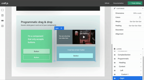
Usage
yarn add @webstencils/layers
import React from "react";
import {Editor} from "@webstencils/core";
import {Layers} from "@webstencils/layers";

export default function App() {
  return (
    <div style={{margin: "0 auto", width: "800px"}}>
      <Typography variant="h5" align="center">A super simple page editor</Typography>
      <Editor resolver={/*...*/}>
        <Layers />
      </Editor>
    </div>
  );
}
Types
Layer
Properties
idNodeId: A randomly generated unique iddepthnumber: A depth of the current Layerexpandedboolean: Returns true if the Layer is expandedeventsObjectselectedboolean: Is true if the layer is clickedhoveredboolean: Is true if the layer is being hovered
domHTMLElement: The DOM of the current layer including its header and children. This is defined by theconnectLayerconnectorheadingDomHTMLElement: The DOM of the current Layer's heading. This is defined by theconnectLayerHeaderconnector
Reference
<Layers />
Props
expandRootOnLoad?boolean: Optional. If enabled, the Root Node will be expanded by defaultrenderLayer?React.ReactElement: Optional. Specify the component to render each layer
useLayer
Parameters
collector(layer: Layer) => Collected: A function that collects relevant state information from the correspondingLayer. The component will re-render when the values returned by this function changes.
Returns
- Object
connectorsObjectdrag(dom: HTMLElement, nodeId: String) => HTMLElement: Specifies the DOM that should be draggablelayer(dom: HTMLElement, nodeId: String): Specifies the DOM that represents the entire LayerlayerHeading(dom: HTMLElement, nodeId: String) => HTMLElement: Specifies the DOM that represents the layer's heading
actionsObjecttoggleLayer() => void: Toggle the corresponding Layer's expanded state
Default components
The following components are available for you to extend if you wish to design your own component to render the layers (which can be specified in the renderLayer prop).
<DefaultLayer /><DefaultLayerHeader /><EditableLayerName>This component enables the end user to edit the layer names. The values are saved into the respective Node'scustom.displayNameprop.
const Layer = () => {
  return (
    <div>
      <DefaultLayerHeader />
    </div>
  )
}

const App = () => {
  return (
    <Editor>
      <Frame>
        {/*...*/}
      </Frame>
      <Layers
        renderLayer={Layer}
      />
    </Editor>
  )
}